Categories
Alex de Visscher Coronavirus Covid-19 Easing

A brief look at model sensitivities to lockdown easing as we prepare for winter

Introduction

This is a very brief look at the model I have been working with for the last few months (thanks again to Prof Alex de Visscher for his original work on the model) to illustrate the sensitivities to lockdown easing settings as we move forward.

The UK Government has just announced some reversals of the current easings, and so before I model the new, additional interventions announced today, I want to illustrate quickly the behaviour of the model in response to changing the effectiveness of current interventions, to reflect the easings that have been made.

The history of UK Government changes, policies and announcements relating to Covid-19 be seen here at the Health Foundation website

Charts direct from the model

I can launch my Octave (MatLab) model direct from the Python code (developed by Dr. Tom Sutton) that interrogates the Worldometers UK reports. Similar information for the any country is available on related pages using the appropriate country code extension, eg for the US here.

The dates, cases and deaths data from Tom’s code are passed to the Octave model , which compares the reported data to the model data and plots charts accordingly.

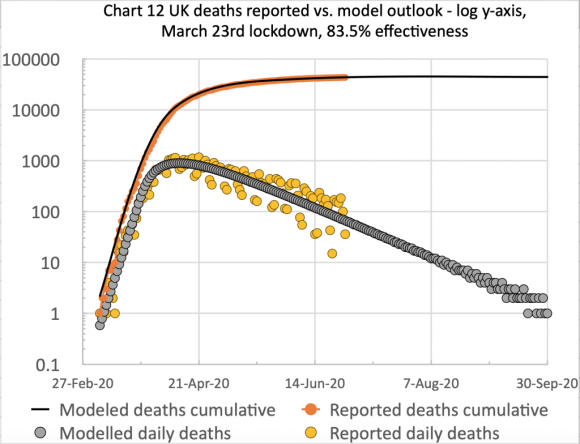
I am showing just one chart 9, for brevity, in six successive versions as a slideshow, which makes it very clear how the successive relaxations of Government interventions (and public behaviour) are represented in the model, and affect the future forecast.

  • Model and reported UK deaths and cases from Feb 1st to Sep 12th with just one easing of .03% after the initial lockdown effectiveness of 84.3%, as shown on the chart
  • Model and reported UK deaths and cases from Feb 1st to Sep 17th with 3 easings after the initial lockdown effectiveness of 84.3%, as shown on the chart
  • Model and reported UK deaths and cases from Feb 1st to Sep 17th with 4 easings after the initial lockdown effectiveness of 84.3%, as shown on the chart
  • Model and reported UK deaths and cases from Feb 1st to Sep 18th with 4 easings after the initial lockdown effectiveness of 84.3%, as shown on the chart
  • Model and reported UK deaths and cases from Feb 1st to Sep 20th with 5 easings after the initial lockdown effectiveness of 84.3%, as shown on the chart
  • Model and reported UK deaths and cases from Feb 1st to Sep 21st with 4 easings and 1 increase after the initial lockdown effectiveness of 84.3%, as shown on the chart

By allowing the slideshow to run, we can see that the model is quite sensitive to the recent successive relaxations of epidemic interventions from Day 155 to Day 227 (July 4th to September 14th).

Charts from the model via spreadsheet analysis

I now show another view of the same data, this time plotted from a spreadsheet populated from the same Octave model, but with daily data plotted on the same charts, offering a little more insight.

  • Model and reported UK deaths and cases from Feb 1st to Sep 12th with just one easing of .03% after the initial lockdown effectiveness of 84.3%, as shown on the chart title
  • Model and reported UK deaths and cases from Feb 1st to Sep 17th with 3 easings after the initial lockdown effectiveness of 84.3%, as shown on the chart title
  • Model and reported UK deaths and cases from Feb 1st to Sep 18th with 4 easings after the initial lockdown effectiveness of 84.3%, as shown on the chart title
  • Model and reported UK deaths and cases from Feb 1st to Sep 20th with 5 easings after the initial lockdown effectiveness of 84.3%, as shown on the chart title
  • Model and reported UK deaths and cases from Feb 1st to Sep 21st with 4 easings and 1 increase after the initial lockdown effectiveness of 84.3%, as shown on the chart title

Here, as well as the cumulative data, we see from the orange dots the scatter of daily reported deaths data (principally caused by lagged data reporting at weekends, with corresponding (upwards) correction in the following days) but also appearing more significant than it really is, because it is plotted at the lower part of the log scale, where the numbers are quite small for the amount of y-axis used to represent them (owing to the log scaling to fit both cumulative and daily reporting on the same chart).

As before, allowing the slideshow to play illustrates the marked effect on the forecast of the increases resulting from the easing of interventions, represented by the % changes to the intervention effectiveness.

This intervention effectiveness started at 84.3%, but on September 20th it was standing at only (84.3 -0.3 -4 -4 -4 -2)% = 70%, although in the last chart I have allowed a 2% increase in effectiveness to reflect some initial UK Government measures to get the virus under control again.

Discussion

The impact of easing of some interventions

As we can see from the model charts, with the UK lockdown relaxation (easing) status as at the last easing point in either presentation, September 14th, there is a quite significant upward tick in the death rate, which follows the earlier upward trend of cases in the UK, previously reported in my most recent post on September 2nd.

It is quite clear to me, in the charts and from the modelling behind them, that the UK’s lockdown, and subsequent series of easing points, has had a marked effect on the epidemic infection rate in the UK. Earlier modelling indicated that had the lockdown been a week or two earlier (I postulated and modelled a March 9th lockdown in particular, and discussed it in two posts on May 14th and June 11th), there would have been far fewer deaths from Covid-19. Prof. Neil Ferguson made this point in his answers to questions at the UK Parliamentary Science & Technology Select Committee on June 10th, as reported in my June 11th post.

Lately, we see that UK Government easing of some aspects of the March 23rd interventions is accompanied by an increase in case (infection) rates, which although more prevalent in the younger, working and socialising population, with a much lower risk of death, is feared to spill over into older parts of the population through families and friends; hence the further UK interventions to come on 24th September.

I am sure that these immediate strategies for controlling (“suppressing”) the epidemic are based on advice from the Scientific Advisory Group for Emergencies (SAGE), and through them by the Scientific Pandemic Influenza Group on Modelling (SPI-M) of which Neil Ferguson and his Imperial College group are part. Sir Patrick Vallance (Chief Scientific Adviser) and Prof. Chris Whitty (Chief Medical Officer), who sit on SAGE, made their own TV presentation direct to the public (with no politicians and no press questions) on 22nd September, outlining the scientific and medical opinions about where we are and where the epidemic is going. The full transcript is here.

Prof Chris Whitty and Sir Patrick Vallance give stark warning about coronavirus in UK

Slides from the presentation:

  • 7-day average cases and deaths per 100,000 for Spain and France
  • Age-dependency in England of cases per 100,000, July to September
  • Postulated outcome at the current growth rate of 7 day doubling time of cases per day åçby October 13th
  • Less than 8% of people have antibiodies
  • Geographical spread of Covid-19 in England
  • Estimated new Covid-19 hospital admissions in England
  • Progress on Vaccines

Returning to the modelling, I am happy to see that the Imperial College data sources, and their model codes are available on their website at https://www.imperial.ac.uk/mrc-global-infectious-disease-analysis/covid-19/. The computer codes are written in the R language, which I have downloaded, as part of my own research, so I look forward to looking at them and reporting later on.

I always take time to mention the pivotal and influential March 16th Imperial College paper that preceded the first UK national lockdown on March 23rd, and the table from it that highlighted the many Non Pharmaceutical Interventions (NPIs) available to Government, and their relative effectiveness alone and in combinations.

I want to emphasise that in this paper, many optional strategies for interventions were considered, and critics of what they see as pessimistic forecasts of deaths in the paper have picked out the largest numbers, in the case of zero or minimal interventions, as if this were the only outcome considered.

The paper is far more nuanced than that, and the table below, while just one small extract, illustrates this. You can see the very wide range of possible outcomes depending on the mix of interventions applied, something I considered in my June 28th blog post.

PC=school and university closure, CI=home isolation of cases, HQ=household quarantine, SD=large-scale general population social distancing, SDOL70=social distancing of those over 70 years for 4 months (a month more than other interventions)

Why was it, I had wondered, that in this chart (on the very last page of the paper, and referenced within it) the effectiveness of the three measures “CI_HQ_SD” in combination (home isolation of cases, household quarantine & large-scale general population social distancing) taken together (orange and yellow colour coding), was LESS than the effectiveness of either CI_HQ or CI_SD taken as a pair of interventions (mainly yellow and green colour coding)?

The answer to my query, from Imperial, was along the following lines, indicating the care to be taken when evaluating intervention options.

It’s a dynamical phenomenon. Remember mitigation is a set of temporary measures. The best you can do, if measures are temporary, is go from the “final size” of the unmitigated epidemic to a size which just gives herd immunity.

If interventions are “too” effective during the mitigation period (like CI_HQ_SD), they reduce transmission to the extent that herd immunity isn’t reached when they are lifted, leading to a substantial second wave. Put another way, there is an optimal effectiveness of mitigation interventions which is <100%.

That is CI_HQ_SDOL70 for the range of mitigation measures looked at in the report (mainly a green shaded column in the table above).

While, for suppression, one wants the most effective set of interventions possible.

All of this is predicated on people gaining immunity, of course. If immunity isn’t relatively long-lived (>1 year), mitigation becomes an (even) worse policy option.

This paper (and Harvard came to similar conclusions at that time) introduced (to me) the potential for a cyclical, multi-phase pandemic, which I discussed in my April 22nd report of the Cambridge Conversation I attended, and here is the relevant illustration from that meeting. This is all about the cyclicity of lockdown followed by easing, the population’s and pandemic’s responses, and repeats of that loop, just what we are seeing at the moment.

Cyclical pandemic behaviour

Key, however, to good modelling is good data, and this is changing all the time. The fine-grained nature of data about schools, travel patterns, work/home locations and the virus behaviour itself are quite beyond an individual to amass. It does require the resources of teams like those at Imperial College, the London School of Hygiene and Tropical Medicine, and in the USA, Harvard, Johns Hopkins and Washington Universities, to name just some prominent ones, whose groups embrace virological, epidemiological and mathematical expertise as well as (presumably) teams of research students to do much of the sifting of data.

Inferences for model types

In my September 2nd recent post, I drew some conclusions from my earlier investigation into mechanistic (bottom-up) and phenomenological/statistical (top-down, exemplified by curve-fitting) modelling techniques. I made it clear that the curve-fitting on its own, while indicative, offers no capability to model intervention methods yet to be made, nor changes in population and individual responses to those Government measures.

In discussing this with someone the other day, he usefully summarised such methods thus: “curve-fitting and least-squares fitting is OK for interpolation, but not for extrapolation”.

The ability of a model to reflect planned or postulated changes to intervention strategies and population responses is vital, as we can see from the many variations made in my model at the various lockdown easing points. Such mechanistic models – derived from realistic infection rates – also allow the case rates and resulting death rates to be assessed bottom-up as a check on reported figures, whereas curve-fitting models are designed only to fit the reported data (unless an overarching assumption is made about under-reporting).

The model shows up this facet of the UK reporting. As in many other countries, there is gross under-estimation of cases, partly because of the lack of a full test and trace system, and partly because testing is not universal. My model is forecasting much nearer to the realistic number of cases, as you will see below; conservatively, the reported numbers are only 10% of the likely infections, probably less.

My final model chart 10, where I have applied an 8.3 multiple to the reported cases to bring them into line with the model, illustrates this. You can just see from the chart, and of course from the daily reported numbers themselves at https://coronavirus.data.gov.uk, that the reported cases are already increasing sharply.

Model and reported UK deaths and cases from Feb 1st to Sep 21st with 4 easings and 1 increase after the initial lockdown effectiveness of 84.3%, as shown on the chart, compared with under-reported cases
Model and reported UK deaths and cases from Feb 1st to Sep 21st with 5 easings and 1 increase after the initial lockdown effectiveness of 84.3%, compared with under-reported cases

You can see from Chart 10 that the plateau for modelled cases is around 3 million. The under-reporting of cases (defining cases as those who have ever had Covid-19) was, in effect, confirmed by the major antibody testing programme, led by Imperial College London, involving over 100,000 people, finding that just under 6% of England’s population – an estimated 3.4 million people – had antibodies to Covid-19, and were therefore likely previously to have had the virus, prior to the end of June.

In this way, mechanistic models can highlight such deficiencies in reporting, as well as modelling the direct effects of intervention measures.

Age-dependency of risk

I have reported before on the startling age dependency of the risk of dying from Covid-19 once contracting it, most recently in my blog post on September 2nd where this chart presenting the changing age dependency of cases appeared, amongst others.

UK weekly confirmed cases by age, published by The Times September 5th 2020

I mention this because the recent period of increasing cases in the UK, but with apparently a lower rate of deaths (although the deaths lag cases by a couple of weeks), has been attributed partly to the lower death risk of the younger (working and socialising) community whose infections are driving the figures. This has been even more noticeable as students have been returning to University.

The following chart from the BBC sourced from PHE data identifies that the caseload in the under-20s comprises predominantly teenagers rather than children of primary school age.

Age-specific IFR estimates
Confirmed Coronavirus cases in England by age group, late August 2020

This has persuaded some to suggest, rather than the postulated restrictions on everyone, that older and more vulnerable people might shield themselves (in effect on a segregated basis) while younger people are more free to mingle. Even some of the older community are suggesting this. To me, that is “turkeys voting for Christmas” (you read it here first, even before the first Christmas jingles on TV ads!)

Not all older or more vulnerable people can, or want to segregate to that extent, and hitherto politicians have tended not to want to discriminate the current interventions in that way.

Scientists, of course, have looked at this, and I add the following by Adam Kucharski (of the modelling team at the London School of Hygiene and Tropical Medicine, and whose opinions I respect as well thought-out)) who presents the following chart in a recent tweet, from a paper authored by himself and others from several Universities about social mixing matrices, those Universities including Cambridge, Harvard and London.

Adam presents this chart, saying “For context, here’s data on pre-COVID social contacts between different age groups in UK outside home/work/school (from: https://medrxiv.org/content/10.1101/2020.02.16.20023754v2…). Dashed box shows over 65s reporting contacts with under 65s.

Contact mixing between age groups calibrated by contacting and contacted age groups

Adam further narrates this chart in a linked series of tweets on Twitter thus:

I’m seeing more and more suggestions that groups at low risk of COVID-19 should go back to normal while high risk groups are protected. What would the logical implications of this be?

First, let’s pick an example definition of risk. If we use infection fatality risk alone for simplicity (which of course isn’t only measure of severity), there is a clear age pattern, which rises above ~0.1% around age 50 and above ~1% around age 70 (https://medrxiv.org/content/10.1101/2020.08.24.20180851v1…)

Age-specific IFR estimates

Suppose hypothetically we define the over 65 age group as ‘high risk’. That’s about 18% of the UK population, and doesn’t include others with health conditions that put them at more at risk of severe COVID.

The question, therefore, would be how to prevent any large outbreak among ‘low risk’ groups from spreading into ‘high risk’ ones without shutting these risk groups out of society for several months or more (if that were even feasible).

There have been attempts to have ‘shielding’ of risk groups (either explicitly or implicitly) in many countries. But large epidemics have still tended to result in infection in these groups, because not all transmission routes were prevented.

So in this hypothetical example, how to prevent contacts in the box from spreading infection into the over 65s? Removing interactions in that box would be removing a large part of people’s lives, but could the contacts be made less risky?

One option would be to use rapid testing to make sure that these contacts are not infectious, e.g. testing attendees ahead of events/venues/gatherings. But remember, 18% of population are over 65, so that’s a lot of (low risk) contacts who would need to be tested regularly.

Then there’s the question of what happens if contacts are positive… Would they need to self-isolate? People might well do anyway if they knew they’re infected, which could reduce wider transmission…

Depending on what % of population is defined as at high risk, and how many contacts are tested regularly and isolate, could well get a situation where measures reduce transmission in the low risk groups too, leading to a low reproduction number.

If this were to happen, it may become equivalent to a light-touch suppression approach via mass testing: https://twitter.com/AdamJKucharski/status/1303245754853658624?s=20…

It wouldn’t be the first example of a situation where we start with two different approaches but end up with similar outcomes: https://twitter.com/AdamJKucharski/status/1292861098971070467?s=20…

This thread obviously just picks a hypothetical example. But hopefully it shows it’s important to explore the logical implications of a particular scenario, because it won’t necessarily lead where we might initially assume.

I have presented that thread pretty much verbatim (well, after all, I can’t deny a vested interest!) to indicate the complexity of the considerations.

His conclusion, in that last link on Twitter, was that “it illustrates that contact tracing and local lockdowns/quarantines aren’t a simple dichotomy – depending on how widely they are targeted, one can end up looking like the other, even if the initial approach is different.

My own opinion is that it isn’t obviously feasible to isolate age-related parts of the community that way – speaking for myself, my own household spans such age groups.

Concluding comments

I support the temporary lockdown, learning the lessons from it and the moves to adjust it (downwards and upwards as judged necessary from sensible forecasts), drawing a balance between the nation’s health and the economic impacts, and I have no time for anything that smacks of anti-vaxxer or conspiracy theories, and anything that might encourage such crackpot ideas.

I’m afraid to say that some of the forecasts published on Twitter, and elsewhere, even by some well-qualified scientists who should know better (and presumably who have their own reasons for doing it – ambition, fame, politics…) do tend to encourage those with such opinions, and I’m very glad to see them called out. References available on application.

Added to the politicising, and subsequent refuting of simple precautions such as face-coverings and social distancing, one of the most dangerous tendencies (in the USA at least, but possibly on the increase here in the UK) is from those who say they won’t take a vaccine when available.

The current UK intervention measures are to be enhanced from tomorrow, September 23rd, following announcements today, as I write this post, and I will update the post to reflect a forecasting analysis including those announced changes.

Categories
Coronavirus Covid-19 Herd Immunity Imperial College Michael Levitt Office for National Statistics ONS PHE Public Health England Superspreader Sweden

Model update following UK revision of Covid-19 deaths reporting

Introduction

On August 12th, the UK Government revised its counting methodology and reporting of deaths from Covid-19, bringing Public Health England’s reporting into line with that from the other home countries, Wales, Northern Ireland and Scotland. I have re-calibrated and re-forecast my model to adapt to this new basis.

Reasons for the change

Previously reported daily deaths in England had set no time limit between any individual’s positive test for Covid-19, and when that person died. 

The three other home countries in the UK applied a 28-day limit for this period. It was felt that, for England, this lack of a limit on the time duration resulted in over-reporting of deaths from Covid-19. Even someone who had died in a road accident, say, would have been reported as a Covid-19 death if they had ever tested positive, and had then recovered from Covid-19, no matter how long before their death this had happened.

This adjustment to the reporting was applied retroactively in England for all reported daily deaths, which resulted in a cumulative reduction of c. 5,000 in the UK reported deaths to up to August 12th.

The UK Government say that it is also to report on a 60-day basis (96% of Covid-19 deaths occur within 60 days and 88% within 28 days), and also on the original basis for comparisons, but these two sets of numbers are not yet available.

On the UK Government’s web page describing the data reporting for deaths, it says “Number of deaths of people who had had a positive test result for COVID-19 and died within 28 days of the first positive test. The actual cause of death may not be COVID-19 in all cases. People who died from COVID-19 but had not tested positive are not included and people who died from COVID-19 more than 28 days after their first positive test are not included. Data from the four nations are not directly comparable as methodologies and inclusion criteria vary.

As I have said before about the excess deaths measure, compared with counting deaths attributed to Covid-19, no measure is without its issues. The phrase in the Government definition above “People who died from COVID-19 but had not tested positive are not included…” highlights such a difficulty.

Model changes

I have adapted my model to this new basis, and present the related charts below.

  • Model forecast for the UK deaths as at August 14th, compared with reported for 84.3% lockdown effectiveness, on March 23rd, modified in 5 steps by -.3%, -0% -0% and -0% successively
  • Model forecast for the UK deaths as at August 14th, compared with reported for 84.3% lockdown effectiveness, modified in 5 steps by -.3%, -0% -0% and -0% successively
  • Model forecast for the UK deaths as at August 14th, compared with reported for 84.3% lockdown effectiveness, on March 23rd, modified in 5 steps by -.3%, -0% -0% and -0% successively
  • Model forecast for the UK deaths as at August 14th, compared with reported for 84.3% lockdown effectiveness, on March 23rd, modified in 5 steps by -.3%, -0% -0% and -0% successively
  • Model forecast for the UK deaths as at August 14th, compared with reported for 84.3% lockdown effectiveness, on March 23rd, modified in 5 steps by -.3%, -0% -0% and -0% successively
  • Chart 12 for the comparison of cumulative & daily reported & modelled deaths to 26th April 2021, adjusted by -.3% on May 13th

This changed reporting basis reduced the cumulative UK deaths to August 12th from 46,706 to 41,329, a reduction of 5,377.

The fit of my model was better for the new numbers, requiring only a small increase in the initial March 23rd lockdown intervention effectiveness from 83.5% to 84.3%, and a single easing reduction to 84% on May 13th, to bring the model into good calibration up to August 14th.

It does bring the model forecast for the long term plateau for deaths down to c. 41,600, and, as you can see from the charts above, this figure is reached by about September 30th 2020.

Discussion

The relationship to case numbers

You can see from the first model chart that the plateau for “Recovered” people is nearly 3 million, which implies that the number of cases is also of the order of 3 million. This startling view is supported by a recent antibody study reported by U.K. Government here.

This major antibody testing programme, led by Imperial College London, involving over 100,000 people, found that just under 6% of England’s population – an estimated 3.4 million people – had antibodies to COVID-19, and were likely to have previously had the virus prior to the end of June.

The reported numbers in the Imperial College study could seem quite surprising, therefore, given that 14 million tests have been carried out in the U.K., but with only 313,798 positive tests reported as at 12th August (and bearing in mind that some people are tested more than once).

But the study is also in line with the estimate made by Prof. Alex de Visscher, author of my original model code, that the number of cases is typically under-reported by a factor of 12.5 – i.e. that only c. 8% of cases are detected and reported, an estimate assessed in the early days for the Italian outbreak, at a time when “test and trace” wasn’t in place anywhere.

A further sanity check on my modelled case numbers, relative to the number of forecasted deaths, would be on the observed mortality from Covid-19 where this can be assessed.

A study by a London School of Hygiene & Tropical Medicine team carried out an analysis of the Covid-19 outbreak in the closed community of the Diamond Princess cruise ship in March 2020.

Adjusting for delay from confirmation-to-death, this paper estimated case and infection fatality ratios (CFR, IFR) for COVID-19 on the Diamond Princess ship as 2.3% (0.75%-5.3%) and 1.2% (0.38-2.7%) respectively.

In broad terms, my model forecast of 42,000 deaths and up to 3 million cases would be a ratio of about 1.4%, and so the relationship between the deaths and cases numbers in my charts doesn’t seem to be unreasonable.

Changing rates of infection

I am not sure whether the current forecast for a further decline in the death rate will remain, in the light of continuing lockdown easing measures, and the local outbreaks.

Both the Office for National Statistics (ONS) and Public Health England (PHE) reported in early July a drop in the rate of decline in Covid-19 cases per 100,000 people in England.

Figure 2: The latest exploratory modelling shows the downward trend in those testing positive for COVID-19 has now levelled off

This was at the same time as the ONS reported that excess deaths have reduced to a level at or below the average for the last five years.

The number of deaths involving COVID-19 decreased for the 10th consecutive week

PHE reports this week that the infection rate is now more pronounced for under-45s than for over-45s, a reversal of the situation earlier in the pandemic. Overall case rates, however, remain lower than before; and although the rate of decline in the case rate has slowed for-over-45s, and is nearly flat now, for under-45s the infection rate has started to increase slightly.

Covid-19 cases rate of decline slows more for under-45s

The impact on the death rate might well be lower than previously, owing to the lower fatality rates for younger people compared with older people.

Herd immunity

Closely related to the testing for Covid-19 antibodies is herd immunity, a topic I covered in some detail on my blog post on June 28th, when I discussed the relative positions of the USA and Europe with regard to the spike in case numbers the USA was experiencing from the middle of June, going on to talk about the Imperial College Coronavirus modelling, led by Prof. Neil Ferguson, and their pivotal March 16th paper.

This paper was much criticised by Prof Michael Levitt, and others, for the hundreds of thousands of deaths it mentioned if no action were taken, cited as scare-mongering, ignoring to some extent the rest of what I think was a much more nuanced paper than was appreciated, exploring, as it did, the various interventions that might be taken as part of what has become known as “lockdown”.

The intervention options were also quite nuanced, embracing as they did (with outcomes coded as they were in the chart below) PC=school and university closure, CI=home isolation of cases, HQ=household quarantine, SD=large-scale general population social distancing, SDOL70=social distancing of those over 70 years for 4 months (a month more than other interventions).

PC=school and university closure, CI=home isolation of cases, HQ=household quarantine, SD=large-scale general population social distancing, SDOL70=social distancing of those over 70 years for 4 months (a month more than other interventions)

I had asked the lead author of the paper why the effectiveness of the three measures “CI_HQ_SD” in combination (home isolation of cases, household quarantine & large-scale general population social distancing) taken together (orange and yellow colour coding), was LESS than the effectiveness of either CI_HQ or CI_SD taken as a pair of interventions (mainly yellow and green colour coding)?

The answer was in terms of any subsequent herd immunity that might or might not be conferred, given that any interventions as part of a lockdown strategy would be temporary. What would happen when they ceased?

The issue was that if the lockdown measures were too effective, then (assuming there were any immunity to be conferred for a usefully long period) the potential for any subsequent herd immunity would be reduced with too successful a lockdown. If there were no worthwhile period of immunity from catching Covid-19, then yes, a full lockdown would be no worse than any other partial strategy.

Sweden

I mention all this as background to a paper that was just published in the Journal of the Royal Society of Medicine as I started this blog post, on August 12th. It concerns the reasons why, as the paper authored by Eric Orlowski and David Goldsmith asserts, that four months into the COVID-19 pandemic, Sweden’s prized herd immunity is nowhere in sight.

This is a somewhat polemical paper, as Sweden is often held up as an example of how countries can succeed in combating the SARS-Cov-2 pandemic by emulating Sweden’s non-lockdown approach. I have been, and remain surprised by such claims, and now this paper helps calibrate and articulate the underlying reasons.

Although compared with the UK, Sweden had done little worse, if at all, despite resisting the lockdown approach (although its demographics and lifestyle characteristics are not necessarily comparable to the UK’s), compared with their more similar nearest neighbours, Norway, Denmark and Finland, Sweden has done far worse in terms of deaths and deaths per capita.

I think that either for political or for other related reasons, perhaps economic ones, even some otherwise sensible scientists are advocating the Swedish approach, somehow ignoring the more valid (and negative) comparisons between Sweden and the other Scandinavian countries, as opposed to more favourable comparisons with others further afield – the UK, for example.

I have tried to remain above the fray, notably on the Twittersphere, but, at least on my own blog, I want to present what I see as a balanced assessment of the evidence.

That balance, in this case, strikes me like this: if there were an argument for the Swedish approach, then a higher level of herd immunity would have been the payoff for experiencing more immediate deaths in favour of a better outcome later.

But that doesn’t seem to have happened, at least in terms of outcomes from testing for antibodies, as presented in this paper. As it says “it is clear that nowhere is the prevalence of IgG seropositivity high (the maximum being around 20%) or climbing convincingly over time. This is especially clear in Sweden, where the authorities publicly predicted 40% seroconversion in Stockholm by May 2020; the actual IgG seroprevalence was around 15%.

Concluding comments

As I said in my August 4th post, the outbreaks we are seeing in some UK localities (Leicester, Manchester, Aberdeen and many others) seem to be the outcome of individual and multiple local super-spreading events.

These are quite hard to model, requiring very fine-grained data regarding the types and extent of population interactions, and the different effects of a range of intervention measures available nationally and locally, as I mentioned above, applied in different places at different times.

The reproduction number, R (even nationally) can be increased noticeably by such localised events, because of the lower overall incidence of cases in the UK (something we have seen in some other countries too, at this phase of the pandemic).

While most people nationally aren’t directly affected by these localised outbreaks, I believe that caution – social distancing where possible, for example – is still necessary.

Categories
Adam Kucharski Alex de Visscher Coronavirus Covid-19 David Spiegelhalter Superspreader Worldometers

Model updates for UK lockdown easing points

Introduction

As I reported in my previous post on 31st July, the model I use, originally authored by Prof. Alex de Visscher at Concordia University in Montreal, and described here, required an update to handle several phases of lockdown easing, and I’m glad to say that is now done.

Alex has been kind enough to send me an updated model code, adopting a method I had been considering myself, introducing an array of dates and intervention effectiveness parameters.

I have been able to add the recent UK Government relaxation dates, and the estimated effectiveness of each into the new model code. I ran some sensitivities which are also reported.

Updated interventions effectiveness and dates

Now that the model can reflect the timing and impact of various interventions and relaxations, I can use the epidemic history to date to calibrate the model against both the initial lockdown on March 23rd, and the relaxations we have seen so far.

Both the UK population (informally) and the Government (formally) are making adjustments to their actions in the light of the threats, actual and perceived, and so the intervention effects will vary.

Model adjustments

At present I am experimenting with different effectiveness percentages relating to four principal lockdown relaxation dates, as described at the Institute for Government website.

In the model, the variable k11 is the starting % infection rate per day per person for SARS-Cov-2, at 0.39, which corresponds to 1 infection every 1/0.39 days ~= 2.5 days per infection.

Successive resetting of the interv_success % model variable allows the lockdown, and its successive easings to be defined in the model. 83.5% (on March 23rd for the initial lockdown) corresponds to k11 x 16.5% as the new infection rate under the initial lockdown, for example.

In the table below, I have also added alternative lockdown easing adjustments in red to show, by comparison, the effect of the forecast, and hence how difficult it will be for a while to assess the impact of the lockdown easings, volatile and variable as they seem to be.

DateDay Steps and example measuresChanges to % effectiveness
23rd March52Lockdown starts+83.5%
13th May105Step 1 – Partial return to work
Those who can work from home should do so, but those who cannot should return to work with social distancing guidance in place. Some sports facilities open.
-1% = 82.5%

-4% = 79.5%
1st June122Step 2 – Some Reception, Year 1 and Year 6 returned to school. People can leave the house for any reason (not overnight). Outdoor markets and car showrooms opened.-5% = 77.5%

-8% = 71.5%
15th June136Step 2 additional – Secondary schools partially reopened for years 10 and 12. All other retail are permitted to re-open with social distancing measures in place.-10% = 67.5%

+10% = 81.5%
4th July155Step 3 – Food service providers, pubs and some leisure facilities are permitted to open, as long as they are able to enact social distancing.+20% = 87.5%

-6% = 75.5%
1st August186Step 3 additional – Shielding for 2m vulnerable people in the UK ceases0% = 87.5%
Dates, examples of measures, and % lockdown effectiveness changes on k11

After the first of these interventions, the 83.5% effectiveness for the original March 23rd lockdown, my model presented a good forecast up until lockdown easing began to happen (both informally and also though Government measures) on May 13th, when Step 1 started, as shown above and in more detail at the Institute for Government website.

Within each easing step, there were several intervention relaxations across different areas of people’s working and personal lives, and I have shown two of the Step 2 components on June 1st and June 15th above.

I applied a further easing % for June 15th (when more Step 2 adjustments were made), and, following Step 3 on July 4th, and the end (for the time being) of shielding for 2m vulnerable people on August 1st, I am expecting another change in mid-August.

I have managed to match the reported data so far with the settings above, noting that even though the July 4th Step 3 was a relaxation, the model matches reported data better when the overall lockdown effectiveness at that time is increased. I expect to adjust this soon to a more realistic assessment of what we are seeing across the UK.

With the % settings in red, the outlook is a little different, and I will show the charts for these a little later in the post

The settings have to reflect not only the various Step relaxation measures themselves, but also Government guidelines, the cumulative changes in public behaviour, and the virus response at any given time.

For example, the wearing of face coverings has become much more common, as mandated in some circumstances but done voluntarily elsewhere by many.

Comparative model charts

The following charts show the resulting changes for the initial easing settings. The first two show the new period of calibration I have used from early March to the present day, August 4th.

On chart 4, on the left, you can see the “uptick” beginning to start, and the model line isn’t far from the 7-day trend line of reported numbers at present (although as of early August possibly falling behind the reported trend a little).

On the linear axis chart 13, on the right, the reported and model curves are far closer than in the version in my most recent post on July 31st, when I showed the effects of lockdown easing on the previous forecasts, and I highlighted the difficulty of updating without a way of parametrising the lockdown easing steps (at that time).

Using the new model capabilities, I have now been able to calibrate the model to the present day, both achieving the good match I already had from March 23rd lockdown to mid-May, and then separately to adjust and calibrate the model behaviour since mid-May to the present day, by adjusting the lockdown effectiveness at May 15th, June 1st, June 15th and July 4th, as described earlier.

The orange dots (the daily deaths) on chart 4 tend to cluster in groups of 4 or 5 per week above the trend line (and also the model line), and 3 or 2 per week below. This is because of the poor accuracy of some reporting at weekends (consistently under-reporting at weekends and recovering by over-reporting early the following week).

The red 7-day trend line on chart 4 reflects the weekly average position.

Looking a little further ahead, to September 30th, this model, with the initial easing settings, predicts the following behaviour, prior to any further lockdown easing adjustments, expected in mid-August.

Chart 12 for the comparison of cumulative & daily reported & modelled deaths, on the basis of 83.5% effectiveness, modified in 4 steps by -1%, -5% -10% and +2% successively
Chart 12 for the comparison of cumulative & daily reported & modelled deaths

Finally, for comparison, the Worldometers UK site has a link to its own forecast site, which has several forecasts depending on assumptions made about mask-wearing, and/or continued mandated lockdown measures, with confidence limits. I have screenshot the forecast on October 1st, where it shows 48,268 deaths assuming current mandates continuing, and mask-wearing.

My own forecast shows 47,201 cumulative deaths at that date.

Worldometers forecasts on the basis of mask wearing vs. no mandated measures, with confidence limits

Alternative % settings in red

I now present a slideshow of the corresponding charts with the red % easing settings. The results here are for the same initial lockdown effectiveness, 83.5%, but with successive easings at -4%, -8%, +10% and -6%, where negative is relaxation, and positive is an increase in intervention effectiveness.

  • Chart 12 for the comparison of cumulative & daily reported & modelled deaths to 26th April 2021, on the basis of 83.5% effectiveness, modified in 4 steps by -4%, -8% +10% and -6%% successively
  • Chart 12 for the comparison of cumulative & daily reported & modelled deaths to 30th Sep 2020, , on the basis of 83.5% effectiveness, modified in 4 steps by -4%, -8% +10% and -6%% successively
  • Chart 4 for the comparison of cumulative & daily reported & modelled deaths, plus reported trend line, on the basis of 83.5% effectiveness
  • Model forecast for the UK deaths as at August 8th, compared with reported for 83.5% lockdown effectiveness
  • Model forecast (linear axes) for the UK deaths as at August 8th, compared with reported for 83.5% lockdown effectiveness, modified in 4 steps by -4%, -8% +10% and -6%% successively

The model forecast here for September 30th is for 49, 549 deaths, and the outlook for the longer term, April 2021, is for 52,544.

Thus the next crucial few months, as the UK adjusts its methods for interventions to be more local and immediate, will be vital in its impact on outcomes. The modelling of how this will work is far more difficult, therefore, with fine-grained data required on virus characteristics, population movement, the comparative effect of different intervention measures, and individual responses and behaviour.

Hotspots and local lockdowns

At present, because the UK reported case number trend has flattened out and isn’t decreasing as fast, and because of some local hotspots of Covid-19 cases, the UK Government has been forced to take some local measures, for example in Leicester a month ago, and more recently in Manchester; the scope and scale of any lockdown adjustments is, therefore, a moving target.

I would expect this to be the pattern for the future, rather than national lockdowns. The work of Adam Kucharski, reported at the Wellcome Open Research website, highlighting the “k-number”, representing the variation, or dispersion in R, the reproduction number, as he says in his Twitter thread, will be an important area to understand.

The k-number might well be more indicative, at this local hotspot stage of the crisis, than just the R reproduction number alone; it has a relationship to the “superspreader” phenomenon discussed for SARS in this 2005 paper, that was also noticed very early on for SARS-Cov-2 in the 2020 pandemic, both in Italy and also in the UK. I will look at that in more detail in another posting.

Superspreading relates to individuals who are infected (probably asymptomatically or pre-symptomatically) who infect others in a closed social space (eg in a ski resort chalet as reported by the BBC on February 8th) without realising it.

The hotspots we are now seeing in many places might well be related to this type of dispersion. The modelling for this would be a further complication, potentially requiring a more detailed spatial model, which I briefly discussed in my blog post on modelling methods on July 14th.

Superspreading might also need to be understood in relation to the opening of schools, in August and September (across the four UK home countries). It might have been a factor in Israel’s experience of return to schools, as covered by the Irish Times on August 4th.

The excess deaths measure

There has been quite a debate on excess deaths (often a seasonal comparison of age-related deaths statistics compared with the previous 5 years) as a measure of the overall position at any time. As I said in a previous post on June 2nd, this measure does mitigate any arguments as to what is a Covid-19 fatality, and what isn’t.

The excess deaths measure, however, has its own issues with regard to the epidemic’s indirect influence on the death rates from other causes, both upwards and downwards.

Since there is less travel (on the roads, for example, with fewer accidents), and many people are taking more care in other ways in their daily lives, deaths from some other causes might tend to reduce.

On the other hand, people are feeling other pressures on their daily lives, affecting their mood and health (for example the weight gain issues reported by the COVID Symptom Study), and some are not seeking medical help as readily as they might have done in other circumstances, for fear of putting themselves at risk of contracting Covid-19. Both factors tend to increase illness and potentially death rates.

Even as excess deaths reduce, then, it may well be that Covid-19 deaths increase as others reduce. Possibly a crossover with seasonal influenza deaths, later on, might be masked by the overall excess deaths measure.

As I also mentioned in my post on July 6th, deaths in later years from other causes might increase because of this lack of timely diagnosis and treatment for other “dread” diseases, as, for example, for cancer, as stated by Data-can.org.uk.

So no measure of the epidemic’s effects is without its issues. Prof. Sir David Spiegelhalter covered this aspect in a newspaper article this week.

Discussion

The statistical interpretation and modelling of data related to the pandemic is a matter of much debate. Some commentators and modellers are proponents of quite different methods of data recording, analysis and forecasting, and I covered phenomenological methods compared with mechanistic (SIR) modelling in previous posts on July 14th and July 18th.

The current reduced rate of decline in cases and deaths in some countries and regions, with concomitant local outbreaks being handled by local intervention measures, including, in effect, local lockdowns, has complicated the predictions of some who think (and have predicted) that the SARS-Cov-2 crisis will soon be over (some possibly for political reasons, some of them scientists).

Even when excess deaths reduce to zero, this doesn’t mean that Covid-19 is over, because, as I mentioned above, illness and deaths from other causes might have reduced, with Covid-19 filling the gap.

There are also concerns that recovery from Covid-19 as a death threat can be followed by longer-lasting illness and symptoms, and some studies (for example this NHLBI one) are gathering evidence, such as that covered by this report in the Thailand Medical News.

This Discharge advice from the UK NHS makes continuing care requirements for discharged Covid-19 patients in the UK very clear.

It is by no means certain, either, that recovery from Covid-19 confers immunity to SARS-Cov-2, and, if it does, for how long.

Concluding comments

I remain of the view that in the absence of a vaccine, or a very effective pharmaceutical treatment therapy, we will be living with SARS-Cov-2 for a long time, and that we do have to continue to be cautious, even (or, rather, especially) as the UK Government (and many others) move to easing national lockdown, at the same time as being forced to enhance some local intervention measures.

The virus remains with us, and Government interventions are changing very fast. Face coverings, post-travel quarantining, office/home working and social distancing decisions, guidance and responses are all moving quite quickly, not necessarily just nationally, but regionally and locally too.

I will continue to sharpen the focus of my own model; I suspect that there will be many revisions and that any forecasts are now being made (including by me) against a moving target in a changing context.

Any forecast, in any country, that it will be all over bar the shouting this summer is at best a hostage to fortune, and, at worst, irresponsible. My own model still requires tuning; in any case, however, I would not be axiomatic about its outputs.

This is an opinion informed by my studies of others’ work, my own modelling, and considerations made while writing my 30 posts on this topic since late March.

Categories
Coronavirus Covid-19 Office for National Statistics ONS PHE Public Health England Worldometers

The effect of lockdown easing in the UK

Introduction

As reported in my previous post, there has been a gradual reduction in the rate of decline of cases and deaths in the UK relative to my model forecasts. This decline had already been noted, as I reported in my July 6th blog article, by The Office for National Statistics and their research partners, the University of Oxford, and reported on the ONS page here.

I had adjusted the original lockdown effectiveness in my model (from 23rd March) to reflect this emerging change, but as the model had been predicting correct behaviour up until mid-late May, I will present here the original model forecasts, compared with the current reported deaths trend, which highlights the changes we have experienced for the last couple of months.

Forecast comparisons

The ONS chart which highlighted this slowing down of the decline, and even a slight increase, is here:

Figure 6: The latest exploratory modelling shows incidence appears to have decreased between mid-May and early June

Public Health England had also reported on this tendency for deaths on 6th July:

The death rate trend can be seen in the daily and 7-day average trend charts, with data from Public Health England
The death rate trend can be seen in the daily and 7-day average trend charts

The Worldometers forecast for the UK has been refined recently, to take account of changes in mandated lockdown measures, such as possible mask wearing, and presents several forecasts on the same chart depending on what take-up would be going forward.

Worldometers forecast for the UK as at July 31st 2020

We see that, at worst, the Worldometers forecast could be for up to 60,000 deaths by November 1st, although, according to their modelling, if masks are “universal” then this is reduced to under 50,000.

Comparison of my forecast with reported data

My two charts that reveal most about the movement in the rate of decline of the UK death rate are here…

On the left, the red trend line for reported daily deaths shows they are not falling as fast as they were in about mid-May, when I was forecasting a long term plateau for deaths at about 44,400, assuming that lockdown effectiveness would remain at 83.5%, i.e. that the virus transmission rate was reduced to 16.5% of what it would be if there were no reductions in social distancing, self isolation or any of the other measures the UK had been taking.

The right hand chart shows the divergence between the reported deaths (in orange) and my forecast (in blue), beginning around mid to late May, up to the end of July.

The forecast, made back in March/April, was tracking the reported situation quite well (if very slightly pessimistically), but around mid-late May we see the divergence begin, and now as I write this, the number of deaths cumulatively is about 2000 more than I was forecasting back in April.

Lockdown relaxations

This period of reduction in the rate of decline of cases, and subsequently deaths, roughly coincided with the start of the UK Govenment’s relaxation of some lockdown measures; we can see the relaxation schedule in detail at the Institute for Government website.

As examples of the successive stages of lockdown relaxation, in Step 1, on May 13th, restrictions were relaxed on outdoor sport facilities, including tennis and basketball courts, golf courses and bowling greens.

In Step 2, from June 1st, outdoor markets and car showrooms opened, and people could leave the house for any reason. They were not permitted to stay overnight away from their primary residence without a ‘reasonable excuse’.

In Step 3, from 4th July, two households could meet indoors or outdoors and stay overnight away from their home, but had to maintain social distancing unless they are part of the same support bubble. By law, gatherings of up to 30 people were permitted indoors and outdoors.

These steps and other detailed measures continued (with some timing variations and detailed changes in the devolved UK administrations), and I would guess that they were anticipated and accompanied by a degree of informal public relaxation, as we saw from crowded beaches and other examples reported in the press.

Model consequences

I did make a re-forecast, reported on July 6th in my blog article, using 83% lockdown effectiveness (from March 23rd).

Two issues remained, however, while bringing the current figures for July more into line.

One was that, as I only have one place in the model that I change the lockdown effectiveness, I had to change it from March 23rd (UK lockdown date), and that made the intervening period for the forecast diverge until it converged again recently and currently.

That can be seen in the right hand chart below, where the blue model curve is well above the orange reported data curve from early May until mid-July.

The long-term plateau in deaths for this model forecast is 46,400; this is somewhat lower than the model would show if I were to reduce the % lockdown effectiveness further, to reflect what is currently happening; but in order to achieve that, the history during May and June would show an even larger gap.

The second issue is that the rate of increase in reported deaths, as we can also see (the orange curve) on the right-hand chart, at July 30th, is clearly greater than the model’s rate (the blue curve), and so I foresee that reported numbers will begin to overshoot the model again.

In the chart on the left, we see the same red trend line for the daily reported deaths, flattening to become nearly horizontal at today’s date, July 31st, reflecting that the daily reported deaths (the orange dots) are becoming more clustered above the grey line of dots, representing modelled daily deaths.

As far as the model is concerned, all this will need to be dealt with by changing the lockdown effectiveness to a time-dependent variable in the model differential equations representing the behaviour of the virus, and the population’s response to it.

This would allow changes in public behaviour, and in public policy, to be reflected by a changed lockdown effectiveness % from time to time, rather than having retrospectively to apply the same (reduced) effectiveness % since the start of lockdown.

Then the forecast could reflect current reporting, while also maintaining the close fit between March 23rd and when mitigation interventions began to ease.

Lockdown, intervention effectiveness and herd immunity

In the interest of balance, in case it might be thought that I am a fan of lockdown(!), I should say that higher % intervention effectiveness does not necessarily lead to a better longer term outlook. It is a more nuanced matter than that.

In my June 28th blog article, I covered exactly this topic as part of my regular Coronavirus update. I referred to the pivotal March 16th Imperial College paper on Non-Pharmaceutical Interventions (NPIs), which included this (usefully colour-coded) table, where green is better and red is worse,

PC=school and university closure, CI=home isolation of cases, HQ=household quarantine, SD=large-scale general population social distancing, SDOL70=social distancing of those over 70 years for 4 months (a month more than other interventions)

which provoked me to re-confirm with the authors (and as covered in the paper) the reasons for the triple combination of CI_HQ_SD being worse than either of the double combinations of measures CI_HQ or CI_SD in terms of peak ICU bed demand.

The answer (my summary) was that lockdown can be too effective, given that it is a temporary state of affairs. When lockdown is partially eased or removed, the population can be left with less herd immunity (given that there is any herd immunity to be conferred by SARS-Cov-2 for any reasonable length of time, if at all) if the intervention effectiveness is too high.

Thus a lower level of lockdown effectiveness, below 100%, can be more effective in the long term.

I’m not seeking to speak to the ethics of sustaining more infections (and presumably deaths) in the short term in the interest of longer term benefits. Here, I am simply looking at the outputs from any postulated inputs to the modelled epidemic process.

I was as surprised as anyone when, in a UK Government briefing, in early March, before the UK lockdown on March 23rd, the Chief Scientific Adviser (CSA, Sir Patrick Vallance), supported by the Chief Medical Officer (CMO, Prof. Chris Whitty) talked about “herd immunity” for the first time, at 60% levels (stating that 80% needing to be infected to achieve it was “loose talk”). I mentioned this in my May 29th blog post.

The UK Government focus later in March (following the March 16th Imperial College paper) quickly turned to mitigating the effect of Covid-19 infections, as this chart sourced from that paper indicates, prior to the UK lockdown on March 23rd.

Projected effectiveness of Covid-19 mitigation strategies, in relation to the utilisation of critical care (ICU) bedsProjected effectiveness of Covid-19 mitigation strategies, in relation to the utilisation of critical care (ICU) beds
Projected effectiveness of Covid-19 mitigation strategies, in relation to the utilisation of critical care (ICU) beds

This is the imagery behind the “flattening the curve” phrase used to describe this phase of the UK (and others’) strategy.

Finally, that Imperial College March 16th paper presents this chart for a potentially cyclical outcome, until a Covid-19 vaccine or a significantly effective pharmaceutical treatment therapy arrives.

The potentially cyclical caseload from Covid-19, with interventions and relaxations applied as ICU bed demand changes

In this new phase of living with Covid-19, this is why I want to upgrade my model to allow periodic intervention effectiveness changes.

Conclusions

The sources I have referenced above support the conclusion in my model that there has been a reduction in the rate of decline of deaths (preceded by a reduction in the rate of decline in cases).

To make my model relevant to the new situation going forward, when lockdowns change, not only in scope and degree, but also in their targeting of localities or regions where there is perceived growth in infection rates, I will need to upgrade my model for variable lockdown effectiveness.

I wouldn’t say that the reduction of the rate of decline of cases and deaths is evidence of a “second wave”, but is rather the response of a very infective agent, which is still with us, to infect more people who are increasingly “available” to it, owing to easing of some of the lockdown measures we have been using (both informally by the public and formally by Government).

To me, it is evidence that until we have a vaccine, we will have to live with this virus among us, and take reasonable precautions within whatever envelope of freedoms the Government allow us.

We are all in each others’ hands in that respect.

Categories
Coronavirus Covid-19 Michael Levitt

Mechanistic and curve-fitting UK modelling comparison

Introduction

In my most recent post, I summarised the various methods of Coronavirus modelling, ranging from phenomenological “curve-fitting” and statistical methods, to the SIR-type models which are developed from differential equations representing postulated incubation, infectivity, transmissibility, duration and immunity characteristics of the SARS-Cov-2 virus pandemic.

The phenomenological methods don’t delve into those postulated causations and transitions of people between Susceptible, Infected, Recovered and any other “compartments” of people for which a mechanistic model simulates the mechanisms of transfers (hence “mechanistic”).

Types of mechanistic SIR models

Some SIR-type mechanistic models can include temporary immunity (or no immunity) (SIRS) models, where the recovered person may return to the susceptible compartment after a period (or no period) of immunity.

SEIRS models allow for an Exposed compartment, for people who have been exposed to the virus, but whose infection is latent for a period, and so who are not infective yet. I discussed some options in my late March post on modelling work reported by the BBC.

My model, based on Alex de Visscher’s code, with my adaptations for the UK, has seven compartments – Uninfected, Infected, Sick, Seriously Sick, Better, Recovered and Deceased. There are many variations on this kind of model, which is described in my April 14th post on modelling progress.

Phenomenological curve-fitting

I have been focusing, in my review of modelling methods, on Prof. Michael Levitt’s curve-fitting approach, which seems to be a well-known example of such modelling, as reported in his recent paper. His small team have documented Covid-19 case and death statistics from many countries worldwide, and use a similar curve-fitting approach to fit current data, and then to forecast how the epidemics might progress, in all of those countries.

Because of the scale of such work, a time-efficient predictive curve-fitting algorithm is attractive, and they have found that a Gompertz function, with appropriately set parameters (three of them) can not only fit the published data in many cases, but also, via a mathematically derived display method for the curves, postulate a straight line predictor (on such “log” charts), facilitating rapid and accurate fitting and forecasting.

Such an approach makes no attempt to explain the way the virus works (not many models do) or to calibrate the rates of transition between the various compartments, which is attempted by the SIR-type models (although requiring tuning of the differential equation parameters for infection rates etc).

In response to the forecasts from these models, then, we see many questions being asked about why the infection rates, death rates and other measured statistics are as they are, differing quite widely from country to country.

There is so much unknown about how SARS-Cov-2 infects humans, and how Covid-19 infections progress; such data models inform the debate, and in calibrating the trajectory of the epidemic data, contribute to planning and policy as part of a family of forecasts.

The problem with data

I am going to make no attempt in this paper, or in my work generally, to model more widely than the UK.

What I have learned from my work so far, in the UK, is that published numbers for cases (particularly) and even, to some extent, for deaths can be unreliable (at worst), untimely and incomplete (often) and are also adjusted historically from time to time as duplication, omission and errors have come to light.

Every week, in the UK, there is a drop in numbers at weekends, recovered by increases in reported numbers on weekdays to catch up. In the UK, the four home countries (and even regions within them) collate and report data in different ways; as recently as July 17th, the Northern Ireland government have said that the won’t be reporting numbers at weekends.

Across the world, I would say it is impossible to compare statistics on a like-for-like basis with any confidence, especially given the differing cultural, demographic and geographical aspects; government policies, health service capabilities and capacities; and other characteristics across countries.

The extent of the (un)reliability in the reported numbers across nations worldwide (just like the variations in the four home UK countries, and in the regions), means that trying to forecast at a high level for all countries is very difficult. We also read of significant variations in the 50 states of the USA in such matters.

Hence my reluctance to be drawn into anything wider than monitoring and trying to predict UK numbers.

Curve fitting my UK model forecast

I thought it would be useful, at least for my understanding, to apply a phenomenological curve fitting approach to some of the UK reported data, and also to my SIR-style model forecast, based on that data.

I find the UK case numbers VERY inadequate for that purpose. There is a fair expectation that we are only seeing a minority fraction (as low as 8% in the early stages, in Italy for example) of the actual infections (cases) in the UK (and elsewhere).

The very definition of what comprises a case is somewhat variable; in the UK we talk about confirmed cases (by test), but the vast majority of people are never tested (owing to a lack of symptoms, and/or not being in hospital) although millions (9 million to date in the UK) of tests have either been done or requested (but not necessarily returned in all cases).

Reported numbers of tests might involve duplication since some people are (rightly) tested multiple times to monitor their condition. It must be almost impossible to make such interpretations consistently across large numbers of countries.

Even the officially reported UK deaths data is undeniably incomplete, since the “all settings” figures the UK Government reports (and at the outset even this had only been hospital deaths, with care homes added (and then retrospectively edited in later on) are not the “excess” deaths that the UK Office for National Statistics (ONS) also track, and that many commentators follow. For consistency I have continued to use the Government reported numbers, their having been updated historically on the same basis.

Rather than using case numbers, then, I will simply make the curve-fitting vs. mechanistic modelling comparison on both the UK reported deaths and the forecasted deaths in my model, which has tracked the reporting fairly well, with some recent adjustments (made necessary by the process of gradual and partial lockdown relaxation during June, I believe).

I had reduced the lockdown intervention effectiveness in my model by 0.5% at the end of June from 83.5% to 83%, because during the relaxations (both informal and formal) since the end of May, my modelled deaths had begun to lag the reported deaths during the month of June.

This isn’t surprising, and is an indicator to me, at least, that lockdown relaxation has somewhat reduced the rate of decline in cases, and subsequently deaths, in the UK.

My current forecast data

Firstly, I present my usual two charts summarising my model’s fit to reported UK data up to and including 16th July.

On the left we see the the typical form of the S-curve that epidemic cumulative data takes, and on the right, the scatter (the orange dots) in the reported daily data, mainly owing to regular incompleteness in weekend reporting, recovered during the following week, every week. I emphasise that the blue and grey curves are my model forecast, with appropriate parameters set for its differential equations (e.g. the 83% intervention effectiveness starting on March 23rd), and are not best fit analytical curves retro-applied to the data.

Next see my model forecast, further out to September 30th, by when forecast daily deaths have dropped to less than one per day, which I will also use to compare with the curve fitting approach. The cumulative deaths plateau, long term, is for 46,421 deaths in this forecast.

UK deaths, reported vs. model, 83%, cumulative and daily, to 30th September

The curve-fitting Gompertz function

I have simplified the calculation of the Gompertz function, since I merely want to illustrate its relationship to my UK forecast – not to use it in anger as my main process, or to develop multiple variations for different countries. Firstly my own basic charts of reported and modelled deaths.

On the left we see the reported data, with the weekly variations I mentioned before (hence the 7-day average to make the trend clearer) and on the right, the modelled version, showing how close the fit is, up to 16th July.

On any given day, the 7-day average lags the barchart numbers when the numbers are growing, and exceeds the numbers when they are declining, as it is taking 7 numbers prior to and up to the reporting day, and averaging them. You can see this more clearly on the right for the smoother modelled numbers (where the averaging isn’t really necessary, of course).

It’s also worth mentioning that the Gompertz function fitting allows its analytical statistical function curve to fit the observed varying growth rate of this SARS-Cov-2 pandemic, with its asymmetry of a slower decline than the steeper ramp-up (sub-exponential though it is) as seen in the charts above.

I now add, to the reported data chart, a graphical version including a derivation of the Gompertz function (the green line) for which I show its straight line trend (the red line). The jagged appearance of the green Gompertz curve on the right is caused by the weekend variation in the reported data, mentioned before.

Those working in the field would use smoothed reported data to reduce this unnecessary clutter, but this adds a layer of complexity to the process, requiring its own justifications, whose detail (and different smoothing options) are out of proportion with this summary.

But for my model forecast, we will see a smoother rendition of the data going into this process. See Michael Levitt’s paper for a discussion of the smoothing options his team uses for data from the many countries the scope of his work includes.

Of course, there are no reported numbers beyond today’s date (16th July) so my next charts, again with the Gompertz equation lines added (in green), compare the fit of the Gompertz version of my model forecast up to July 16th (on the right) with the reported data version (on the left) from above – part of the comparison purpose of this exercise.

The next charts, with the Gompertz equation lines added (in green), compare the fit of my model forecast only (i.e. not the reported data) up to July 16th on the left, with the forecast out to September 30th on the right.

What is notable about the charts is the nearly straight line appearance of the Gompertz version of the data. The wiggles approaching late September on the right are caused by some gaps in the data, as some of the predicted model numbers for daily deaths are zero at that point; the ratios (c(t)/c(t-1)) and logarithmic calculation Ln(c(t)/c(t-1)) have some necessary gaps on some days (division by 0, and ln(0) being undefined).

Discussion

The Gompertz method potentially allows a straight line extrapolation of the reported data in this form, instead of developing SIR-style non-linear differential equations for every country. This means much less scientific and computer time to develop and process, so that Michael Levitt’s team can process many country datasets quickly, via the Gompertz functional representation of reported data, to create the required forecasts.

As stated before, this method doesn’t address the underlying mechanisms of the spread of the epidemic, but policy makers might sometimes simply need the “what” of the outlook, and not the “how” and “why”. The assessment of the infectivity and other disease characteristics, and the related estimation of their representation by coefficients in the differential equations for mechanistic models, might not be reliably and quickly done for this novel virus in so many different countries.

When policy makers need to know the potential impact of their interventions and actions, then mechanistic models can and do help with those dependencies, under appropriate assumptions.

As mentioned in my recent post on modelling methods, such mechanistic models might use mobility and demographic data to predict contact rates, and will, at some level of detail, model interventions such as social distancing, hygiene improvements and the use of masks, as well as self-isolation (or quarantine) for suspected cases, and for people in high risk groups (called shielding in the UK) such as the elderly or those with underlying health conditions.

Michael Levitt’s (and other) phenomenological methods don’t do this, since they are fitting chosen analytical functions to the (cleaned and smoothed) cases or deaths data, looking for patterns in the “output” data for the epidemic in a country, rather than for the causations for, and implications of the “input” data.

In Michael’s case, an important variable that is used is the ratio of successive days’ cases data, which means that the impact of national idiosyncrasies in data collection are minimised, since the same method is in use on successive days for the given country.

In reality, the parameters that define the shape (growth rate, inflection point and decline rate) of the specific Gompertz function used would also have to be estimated or calculated, with some advance idea of the plateau figure (what is called the “carrying capacity” of the related Generalised Logistics Functions (GLFs) of which the Gompertz functions comprise a subset).

I have taken some liberties here with the process, since my aim was simply to illustrate the technique using a forecast I already have.

Closing remarks

I have some corrective and clarification work to do on this methodology, but my intention has merely been to compare and contrast two methods of producing Covid-19 forecasts – phenomenological curve-fitting vs. SIR modelling.

These is much that the professionals in this field have yet to do. Many countries are struggling to move from blanket lockdown, through to a more targeted approach, using modelling to calibrate the changing effect of the various sub-measures in the lockdown package. I covered some of those differential effects of intervention options in my post on June 28th, including the consideration of any resulting “herd immunity” as a future impact of the relative efficacy of current intervention methods.

From a planning and policy perspective, Governments have to consider the collateral health impact of such interventions, which is why the excess deaths outlook is important, taking into account the indirect effect of both Covid-19 infections, and also the cumulative health impacts of the methods (such as quarantining and social distancing) used to contain the virus.

One of these negative impacts is on the take-up of diagnosis and treatment of other serious conditions which might well cause many further excess deaths next year, to which I referred in my modelling update post of July 6th, referencing a report by Health Data Research UK, quoting Data-Can.org.uk about the resulting cancer care issues in the UK.

Politicians also have to cope with the economic impact, which also feeds back into the nation’s health.

Hence the narrow numbers modelling I have been doing is only a partial perspective on a very much bigger set of problems.

Categories
Coronavirus Covid-19 Imperial College Michael Levitt Reproductive Number

Phenomenology & Coronavirus – modelling and curve-fitting

Introduction

I have been wondering for a while how to characterise the difference in approaches to Coronavirus modelling of cases and deaths, between “curve-fitting” equations and the SIR differential equations approach I have been using (originally developed in Alex de Visscher’s paper this year, which included code and data for other countries such as Italy and Iran) which I have adapted for the UK.

Part of my uncertainty has its roots in being a very much lapsed mathematician, and part is because although I have used modelling tools before, and worked in some difficult area of mathematical physics, such as General Relativity and Cosmology, epidemiology is a new application area for me, with a wealth of practitioners and research history behind it.

Curve-fitting charts such as the Sigmoid and Gompertz curves, all members of a family of curves known as logistics or Richards functions, to the Coronavirus cases or deaths numbers as practised, notably, by Prof. Michael Levitt and his Stanford University team has had success in predicting the situation in China, and is being applied in other localities too.

Michael’s team have now worked out an efficient way of reducing the predictive aspect of the Gompertz function and its curves to a straight line predictor of reported data based on a version of the Gompertz function, a much more efficient use of computer time than some other approaches.

The SIR model approach, setting up an series of related differential equations (something I am more used to in other settings) that describe postulated mechanisms and rates of virus transmission in the human population (hence called “mechanistic” modelling), looks beneath the surface presentation of the epidemic cases and deaths numbers and time series charts, to model the growth (or otherwise) of the epidemic based on postulated characteristics of viral transmission and behaviour.

Research literature

In researching the literature, I have become familiar with some names that crop up or frequently in this area over the years.

Focusing on some familiar and frequently recurring names, rather than more recent practitioners, might lead me to fall into “The Trouble with Physics” trap (the tendency, highlighted by Lee Smolin in his book of that name, exhibited by some University professors to recruit research staff (“in their own image”) who are working in the mainstream, rather than outliers whose work might be seen as off-the-wall, and less worthy in some sense.)

In this regard, Michael Levitt‘s new work in the curve-fitting approach to the Coronavirus problem might be seen by others who have been working in the field for a long time as on the periphery (despite his Nobel Prize in Computational Biology and Stanford University position as Professor of Structural Biology).

His results (broadly forecasting, very early on, using his curve-fitting methods (he has used Sigmoid curves before, prior to the current Gompertz curves), a much lower incidence of the virus going forward, successfully so in the case of China) are in direct contrast to that of some some teams working as advisers to Governments, who have, in some cases, all around the world, applied fairly severe lockdowns for a period of several months in most cases.

In particular the work of the Imperial College Covid response team, and also the London School of Hygiene and Tropical Medicine have been at the forefront of advice to the UK Government.

Some Governments have taken a different approach (Sweden stands out in Europe in this regard, for several reasons).

I am keen to understand the differences, or otherwise, in such approaches.

Twitter and publishing

Michael chooses to publish his work on Twitter (owing to a glitch (at least for a time) with his Stanford University laboratory‘s own publishing process. There are many useful links there to his work.

My own succession of blog posts (all more narrowly focused on the UK) have been automatically published to Twitter (a setting I use in WordPress) and also, more actively, shared by me on my FaceBook page.

But I stopped using Twitter routinely a long while ago (after 8000+ posts) because, in my view, it is a limited communication medium (despite its reach), not allowing much room for nuanced posts. It attracts extremism at worst, conspiracy theorists to some extent, and, as with a lot of published media, many people who choose on a “confirmation bias” approach to read only what they think they might agree with.

One has only to look at the thread of responses to Michael’s Twitter links to his forecasting results and opinions to see examples of all kinds of Twitter users: some genuinely academic and/or thoughtful; some criticising the lack of published forecasting methods, despite frequent posts, although they have now appeared as a preprint here; many advising to watch out (often in extreme terms) for “big brother” government when governments ask or require their populations to take precautions of various kinds; and others simply handclapping, because they think that the message is that this all might go away without much action on their part, some of them actively calling for resistance even to some of the most trivial precautionary requests.

Preamble

One of the recent papers I have found useful in marshalling my thoughts on methodologies is this 2016 one by Gustavo Chowell, and it finally led me to calibrate the differences in principle between the SIR differential equation approach I have been using (but a 7-compartment model, not just three) and the curve-fitting approach.

I had been thinking of analogies to illustrate the differences (which I will come to later), but this 2016 Chowell paper, in particular, encapsulated the technical differences for me, and I summarise that below. The Sergio Alonso paper also covers this ground.

Categorization of modelling approaches

Gerard Chowell’s 2016 paper summarises modelling approaches as follows.

Phenomenological models

A dictionary definition – “Phenomenology is the philosophical study of observed unusual people or events as they appear without any further study or explanation.”

Chowell states that phenomenological approaches for modelling disease spread are particularly suitable when significant uncertainty clouds the epidemiology of an infectious disease, including the potential contribution of multiple transmission pathways.

In these situations, phenomenological models provide a starting point for generating early estimates of the transmission potential and generating short-term forecasts of epidemic trajectory and predictions of the final epidemic size.

Such methods include curve fitting, as used by Michael Levitt, where an equation (represented by a curve on a time-incidence graph (say) for the virus outbreak), with sufficient degrees of freedom, is used to replicate the shape of the observed data with the chosen equation and its parameters. Sigmoid and Gompertz functions (types of “logistics” or Richards functions) have been used for such fitting – they produce the familiar “S”-shaped curves we see for epidemics. The starting growth rate, the intermediate phase (with its inflection point) and the slowing down of the epidemic, all represented by that S-curve, can be fitted with the equation’s parametric choices (usually three or four).

This chart was put up by Michael Levitt on July 8th to illustrate curve fitting methodology using the Gompertz function. See https://twitter.com/MLevitt_NP2013/status/1280926862299082754
Chart by Michael Levitt illustrating his Gompertz function curve fitting methodology

A feature that some epidemic outbreaks share is that growth of the epidemic is not fully exponential, but is “sub-exponential” for a variety of reasons, and Chowell states that:

Previous work has shown that sub-exponential growth dynamics was a common phenomenon across a range of pathogens, as illustrated by empirical data on the first 3-5 generations of epidemics of influenza, Ebola, foot-and-mouth disease, HIV/AIDS, plague, measles and smallpox.”

Choices of appropriate parameters for the fitting function can allow such sub-exponential behaviour to be reflected in the chosen function’s fit to the reported data, and it turns out that the Gompertz function is more suitable for this than the Sigmoid function, as Michael Levitt states in his recent paper.

Once a curve-fit to reported data to date is achieved, the curve can be used to make forecasts about future case numbers.

Mechanistic and statistical models

Chowell states that “several mechanisms have been put forward to explain the sub-exponential epidemic growth patterns evidenced from infectious disease outbreak data. These include spatially constrained contact structures shaped by the epidemiological characteristics of the disease (i.e., airborne vs. close contact transmission model), the rapid onset of population behavior changes, and the potential role of individual heterogeneity in susceptibility and infectivity.

He goes on to say that “although attractive to provide a quantitative description of growth profiles, the generalized growth model (described earlier) is a phenomenological approach, and hence cannot be used to evaluate which of the proposed mechanisms might be responsible for the empirical patterns.

Explicit mechanisms can be incorporated into mathematical models for infectious disease transmission, however, and tested in a formal way. Identification and analysis of the impacts of these factors can lead ultimately to the development of more effective and targeted control strategies. Thus, although the phenomenological approaches above can tell us a lot about the nature of epidemic patterns early in an outbreak, when used in conjunction with well-posed mechanistic models, researchers can learn not only what the patterns are, but why they might be occurring.

On the Imperial College team’s planning website, they state that their forecasting models (they have several for different purposes, for just these reasons I guess) fall variously into the “Mechanistic” and “Statistical” categories, as follows.

COVID-19 planning tools
Imperial College models use a combination of mechanistic and statistical approaches.

Mechanistic model: Explicitly accounts for the underlying mechanisms of diseases transmission and attempt to identify the drivers of transmissibility. Rely on more assumptions about the disease dynamics.

Statistical model: Do not explicitly model the mechanism of transmission. Infer trends in either transmissibility or deaths from patterns in the data. Rely on fewer assumptions about the disease dynamics.

Mechanistic models can provide nuanced insights into severity and transmission but require specification of parameters – all of which have underlying uncertainty. Statistical models typically have fewer parameters. Uncertainty is therefore easier to propagate in these models. However, they cannot then inform questions about underlying mechanisms of spread and severity.

So Imperial College’s “statistical” description matches more to Chowell’s description of a phenomenological approach, although may not involve curve-fitting per se.

The SIR modelling framework, employing differential equations to represent postulated relationships and transitions between Susceptible, Infected and Recovered parts of the population (at its most simple) falls into this Mechanistic model category.

Chowell makes the following useful remarks about SIR style models.

The SIR model and derivatives is the framework of choice to capture population-level processes. The basic SIR model, like many other epidemiological models, begins with an assumption that individuals form a single large population and that they all mix randomly with one another. This assumption leads to early exponential growth dynamics in the absence of control interventions and susceptible depletion and greatly simplifies mathematical analysis (note, though, that other assumptions and models can also result in exponential growth).

The SIR model is often not a realistic representation of the human behavior driving an epidemic, however. Even in very large populations, individuals do not mix randomly with one another—they have more interactions with family members, friends, and coworkers than with people they do not know.

This issue becomes especially important when considering the spread of infectious diseases across a geographic space, because geographic separation inherently results in nonrandom interactions, with more frequent contact between individuals who are located near each other than between those who are further apart.

It is important to realize, however, that there are many other dimensions besides geographic space that lead to nonrandom interactions among individuals. For example, populations can be structured into age, ethnic, religious, kin, or risk groups. These dimensions are, however, aspects of some sort of space (e.g., behavioral, demographic, or social space), and they can almost always be modeled in similar fashion to geographic space“.

Here we begin to see the difference I was trying to identify between the curve-fitting approach and my forecasting method. At one level, one could argue that curve-fitting and SIR-type modelling amount to the same thing – choosing parameters that make the theorised data model fit the reported data.

But, whether it produces better or worse results, or with more work rather than less, SIR modelling seeks to understand and represent the underlying virus incubation period, infectivity, transmissibility, duration and related characteristics such as recovery and immunity (for how long, or not at all) – the why and how, not just the what.

The (nonlinear) differential equations are then solved numerically (rather than analytically with exact functions) and there does have to be some fitting to the initial known data for the outbreak (i.e. the history up to the point the forecast is being done) to calibrate the model with relevant infection rates, disease duration and recovery timescales (and death rates).

This makes it look similar in some ways to choosing appropriate parameters for any function (Sigmoid, Gompertz or General Logistics function (often three or four parameters)).

But the curve-fitting approach is reproducing an observed growth pattern (one might say top-down, or focused on outputs), whereas the SIR approach is setting virological and other behavioural parameters to seek to explain the way the epidemic behaves (bottom-up, or focused on inputs).

Metapopulation spatial models

Chowell makes reference to population-level models, formulations that are used for the vast majority of population based models that consider the spatial spread of human infectious diseases and that address important public health concerns rather than theoretical model behaviour. These are beyond my scope, but could potentially address concerns about indirect impacts of the Covid-19 pandemic.

a) Cross-coupled metapopulation models

These models, which have been used since the 1940s, do not model the process that brings individuals from different groups into contact with one another; rather, they incorporate a contact matrix that represents the strength or sum total of those contacts between groups only. This contact matrix is sometimes referred to as the WAIFW, or “who acquires infection from whom” matrix.

In the simplest cross-coupled models, the elements of this matrix represent both the influence of interactions between any two sub-populations and the risk of transmission as a consequence of those interactions; often, however, the transmission parameter is considered separately. An SIR style set of differential equations is used to model the nature, extent and rates of the interactions between sub-populations.

b) Mobility metapopulation models

These models incorporate into their structure a matrix to represent the interaction between different groups, but they are mechanistically oriented and do this by considering the actual process by which such interactions occur. Transmission of the pathogen occurs within sub-populations, but the composition of those sub-populations explicitly includes not only residents of the sub-population, but visitors from other groups.

One type of model uses a “gravity” approach for inter-population interactions, where contact rates are proportional to group size and inversely proportional to the distance between them.

Another type described by Chowell uses a “radiation” approach, which uses population data relating to home locations, and to job locations and characteristics, to theorise “travel to work” patterns, calculated using attractors that such job locations offer, influencing workers’ choices and resulting travel and contact patterns.

Transportation and mobile phone data can be used to populate such spatially oriented models. Again SIR-style differential equations are used to represent the assumptions in the model about between whom, and how the pandemic spreads.

Summary of model types

We see that there is a range of modelling methods, successively requiring more detailed data, but which seek increasingly to represent the mechanisms (hence “mechanistic” modelling) by which the virus might spread.

We can see the key difference between curve-fitting (what I called a surface level technique earlier) and the successively more complex models that seek to work from assumed underlying causations of infection spread.

An analogy (picking up on the word “surface” I have used here) might refer to explaining how waves in the sea behave. We are all aware that out at sea, wave behaviour is perceived more as a “swell”, somewhat long wavelength waves, sometimes of great height, compared with shorter, choppier wave behaviour closer to shore.

I’m not here talking about breaking waves – a whole separate theory is needed for those – René Thom‘s Catastrophe Theory – but continuous waves.

A curve fitting approach might well find a very good fit using trigonometric sine waves to represent the wavelength and height of the surface waves, even recognising that they can be encoded by depth of the ocean, but it would need an understanding of hydrodynamics, as described, for example, by Bernoulli’s Equation, to represent how and why the wavelength and wave height (and speed*) changes depending on the depth of the water (and some other characteristics).

(*PS remember that the water moves, pretty much, up and down, in an elliptical path for any fluid “particle”, not in the direction of travel of the observed (largely transverse) wave. The horizontal motion and speed of the wave is, in a sense, an illusion.)

Concluding comments

There is a range of modelling methods, successively requiring more detailed data, from phenomenological (statistical and curve-fitting) methods, to those which seek increasingly to represent the mechanisms (hence “mechanistic”) by which the virus might spread.

We see the difference between curve-fitting and the successively more complex models that build a model from assumed underlying interactions, and causations of infection spread between parts of the population.

I do intend to cover the mathematics of curve fitting, but wanted first to be sure that the context is clear, and how it relates to what I have done already.

Models requiring detailed data about travel patterns are beyond my scope, but it is as well to set into context what IS feasible.

Setting an understanding of curve-fitting into the context of my own modelling was a necessary first step. More will follow.

References

I have found several papers very helpful on comparing modelling methods, embracing the Gompertz (and other) curve-fitting approaches, including Michaels Levitt’s own recent June 30th one, which explains his methods quite clearly.

Gerard Chowell’s 2016 paper on Mathematical model types September 2016

The Coronavirus Chronologies – Michael Levitt, 13th March 2020

COVID-19 Virus Epidemiological Model Alex de Visscher, Concordia University, Quebec, 22nd March 2020

Empiric model for short-time prediction of Covid-19 spreading , Sergio Alonso et al, Spain, 19th May 2020

Universality in Covid-19 spread in view of the Gompertz function Akira Ohnishi et al, Kyoto University) 22nd June 2020

Predicting the trajectory of any Covid-19 epidemic from the best straight line – Michael Levitt et al 30th June 2020

Categories
Coronavirus Covid-19 Worldometers

Coronavirus modelling update

Introduction

In my previous post on June 28th, I covered the USA vs. Europe Coronavirus pandemic situations; herd immunity, and the effects of various interventions on it, particularly as envisioned by the Imperial College Covid-19 response team; and the current forecasts for cases and deaths in the UK.

I have now updated the forecasts, as it was apparent that during the month of June, there had been a slight increase in the forecast for UK deaths. Worldometers’ forecast had increased, and also the reported UK numbers were now edging above the forecast in my own model, which had been tracking well as a forecast (if very slightly pessimistically) until the beginning of June.

This might be owing both to informal public relaxation of lockdown behaviour, and also to formal UK Government relaxations in some intervention measures since the end of May.

Re-forecast

I have now reforecast my model with a slightly lower intervention effectiveness (83% instead of 83.5% since lockdown on 23rd March), and, while still slightly below reported numbers, it is nearly on track (although with the reporting inaccuracy each weekend, it’s not practical to try to track every change).

My long term outlook for deaths is now for 46,421 instead of 44,397, still below the Worldometers number (which has increased to 47,924 from 43,962).

Here are the comparative charts – first, the reported deaths (the orange curve) vs. modelled deaths (the blue curve), linear axes, as of July 6th.

Comparing this pair of charts, we see that the .5% reduction in lockdown intervention effectiveness (from March 23rd) brings the forecast, the blue curve on the left chart, above the reported orange curve. On the right, the forecast, which had been tracking the reported numbers for a month or more, had started to lag the reported numbers since the beginning of June.

I present below both cumulative and daily numbers of deaths, reported vs. forecast, with log y-axis. The scatter in the daily reported numbers (orange dots) is because of inconsistencies in reporting at weekends, recovered during each following week.

In this second pair of charts, we can just see that the rate of decline in daily deaths, going forward, is slightly reduced in the 83% chart on the left, compared with the 83.5% on the right.

This means that the projected plateau in modelled deaths, as stated above, is at 46,421 instead of 44,397 in my modelled data from which these charts are drawn.

It also shows that the forecast reduction to single digit (<10) deaths per day is pushed out from 13th August to 20th August, and the forecast rate of fewer than one death per day is delayed from 21st September to 30th September.

ONS & PHE work on trends, and concluding comments

Since the beginning of lockdown relaxations, there has been sharpened scrutiny of the case and death numbers. This monitoring continues with the latest announcements by the UK Government, taking effect from early July (with any accompanying responses to follow from the three UK devolved administrations).

The Office for National Statistics has been monitoring cases and deaths rates, of course, and the flattening of the infections and deaths reductions has been reported in the press recently.

July 3rd Times reporting ONS regarding trends in Covid-19 incidence rates and deaths

As the article says, any movement would firstly be in the daily number of cases, with any potential change in the deaths rate following a couple of weeks after (owing to the Covid-19 disease duration).

Source data for the reported infection rate is on the following ONS chart (Figure 6 on their page), where the latest exploratory modelling, by ONS research partners at the University of Oxford, shows the incidence rate appears to have decreased between mid-May and early June, but has since levelled off.

Figure 6: The latest exploratory modelling shows incidence appears to have decreased between mid-May and early June
Estimated numbers of new infections of the coronavirus (COVID-19), England, based on tests conducted daily since 11 May 2020

The death rate trend can be seen in the daily and 7-day average trend charts, with data from Public Health England.

The ONS is also tracking Excess deaths, and it seems that the Excess deaths in 2020 in England & Wales have reduced to below the five-year average for the second consecutive week.

The figures can be seen in the spreadsheet here, downloaded from the ONS page. The following chart appears there as Figure 1, also showing that the number of deaths involving Covid-19 decreased for the 10th consecutive week.

Number of deaths registered by week, England & Wales, Dec 2019 to 26th June 2020

There are warnings, however, also reported by The Times, that there may be increased mortality from other diseases (such as cancer) into 2021 because worries about the pandemic haves led to changes in patterns of use of the NHS, including GPs, with fewer people risking trips to hospital for diagnosis and/or treatment. The report referred to below from Data-can.org.uk highlights this

I will make any adjustments to the rate of change as we go forward, but thankfully daily numbers are just reducing at the moment in the UK, and I hope that this continues.

Categories
Coronavirus Covid-19 Herd Immunity Imperial College Reproductive Number

Some thoughts on the current UK Coronavirus position

Introduction

A couple of interesting articles on the Coronavirus pandemic came to my attention this week; a recent one in National Geographic on June 26th, highlighting a startling comparison, between the USA’s cases history, and recent spike in case numbers, with the equivalent European data, referring to an older National Geographic article, from March, by Cathleen O’Grady, referencing a specific chart based on work from the Imperial College Covid-19 Response team.

I noticed, and was interested in that reference following a recent interaction I had with that team, regarding their influential March 16th paper. It prompted more thought about “herd immunity” from Covid-19 in the UK.

Meanwhile, my own forecasting model is still tracking published data quite well, although over the last couple of weeks I think the published rate of deaths is slightly above other forecasts as well as my own.

The USA

The recent National Geographic article from June 26th, by Nsikan Akpan, is a review of the current situation in the USA with regard to the recent increased number of new confirmed Coronavirus cases. A remarkable chart at the start of that article immediately took my attention:

7 day average cases from the US Census Bureau chart, NY Times / National Geographic

The thrust of the article concerned recommendations on public attitudes, activities and behaviour in order to reduce the transmission of the virus. Even cases per 100,000 people, the case rate, is worse and growing in the USA.

7 day average cases per 100,000 people from the US Census Bureau chart, NY Times / National Geographic

A link between this dire situation and my discussion below about herd immunity is provided by a reported statement in The Times by Dr Anthony Fauci, Director of the National Institute of Allergy and Infectious Diseases, and one of the lead members of the Trump Administration’s White House Coronavirus Task Force, addressing the Covid-19 pandemic in the United States.

Reported Dr Fauci quotation by the Times newspaper 30th June 2020

If the take-up of the vaccine were 70%, and it were 70% effective, this would result in roughly 50% herd immunity (0.7 x 0.7 = 0.49).

If the innate characteristics of the the SARS-CoV-2 virus don’t change (with regard to infectivity and duration), and there is no other human-to-human infection resistance to the infection not yet understood that might limit its transmission (there has been some debate about this latter point, but this blog author is not a virologist) then 50% is unlikely to be a sufficient level of population immunity.

My remarks later about the relative safety of vaccination (eg MMR) compared with the relevant diseases themselves (Rubella, Mumps and Measles in that case) might not be supported by the anti-Vaxxers in the US (one of whose leading lights is the disgraced British doctor, Andrew Wakefield).

This is just one more complication the USA will have in dealing with the Coronavirus crisis. It is one, at least, that in the UK we won’t face to anything like the same degree when the time comes.

The UK, and implications of the Imperial College modelling

That article is an interesting read, but my point here isn’t really about the USA (worrying though that is), but about a reference the article makes to some work in the UK, at Imperial College, regarding the effectiveness of various interventions that have been or might be made, in different combinations, work reported in the National Geographic back on March 20th, a pivotal time in the UK’s battle against the virus, and in the UK’s decision making process.

This chart reminded me of some queries I had made about the much-referenced paper by Neil Ferguson and his team at Imperial College, published on March 16th, that seemed (with others, such as the London School of Hygiene and Infectious Diseases) to have persuaded the UK Government towards a new approach in dealing with the pandemic, in mid to late March.

Possible intervention strategies in the fight against Coronavirus

The thrust of this National Geographic article, by Cathleen O’Grady, was that we will need “herd immunity” at some stage, even if the Imperial College paper of March 16th (and other SAGE Committee advice, including from the Scientific Pandemic Influenza Group on Modelling (SPI-M)) had persuaded the Government to enforce several social distancing measures, and by March 23rd, a combination of measures known as UK “lockdown”, apparently abandoning the herd immunity approach.

The UK Government said that herd immunity had never been a strategy, even though it had been mentioned several times, in the Government daily public/press briefings, by Sir Patrick Vallance (UK Chief Scientific Adviser (CSA)) and Prof Chris Whitty (UK Chief Medical Officer (CMO)), the co-chairs of SAGE.

The particular part of the 16th March Imperial College paper I had queried with them a couple of weeks ago was this table, usefully colour coded (by them) to allow the relative effectiveness of the potential intervention measures in different combinations to be assessed visually.


PC=school and university closure, CI=home isolation of cases, HQ=household quarantine, SD=large-scale general population social distancing, SDOL70=social distancing of those over 70 years for 4 months (a month more than other interventions)

Why was it, I wondered, that in this chart (on the very last page of the paper, and referenced within it) the effectiveness of the three measures “CI_HQ_SD” in combination (home isolation of cases, household quarantine & large-scale general population social distancing) taken together (orange and yellow colour coding), was LESS than the effectiveness of either CI_HQ or CI_SD taken as a pair of interventions (mainly yellow and green colour coding)?

The explanation for this was along the following lines.

It’s a dynamical phenomenon. Remember mitigation is a set of temporary measures. The best you can do, if measures are temporary, is go from the “final size” of the unmitigated epidemic to a size which just gives herd immunity.

If interventions are “too” effective during the mitigation period (like CI_HQ_SD), they reduce transmission to the extent that herd immunity isn’t reached when they are lifted, leading to a substantial second wave. Put another way, there is an optimal effectiveness of mitigation interventions which is <100%.

That is CI_HQ_SDOL70 for the range of mitigation measures looked at in the report (mainly a green shaded column in the table above).

While, for suppression, one wants the most effective set of interventions possible.

All of this is predicated on people gaining immunity, of course. If immunity isn’t relatively long-lived (>1 year), mitigation becomes an (even) worse policy option.

Herd Immunity

The impact of very effective lockdown on immunity in subsequent phases of lockdown relaxation was something I hadn’t included in my own (single phase) modelling. My model can only (at the moment) deal with one lockdown event, with a single-figure, averaged intervention effectiveness percentage starting at that point. Prior data is used to fit the model. It has served well so far, until the point (we have now reached) at which lockdown relaxations need to be modelled.

But in my outlook, potentially, to modelling lockdown relaxation, and the potential for a second (or multiple) wave(s), I had still been thinking only of higher % intervention effectiveness being better, without taking into account that negative feedback to the herd immunity characteristic, in any subsequent more relaxed phase, other than through the effect of the changing comparative compartment sizes in the SIR-style model differential equations.

I covered the 3-compartment SIR model in my blog post on April 8th, which links to my more technical derivation here, and more complex models (such as the Alex de Visscher 7-compartment model I use in modified form, and that I described on April 14th) that are based on this mathematical model methodology.

In that respect, the ability for the epidemic to reproduce, at a given time “t” depends on the relative sizes of the infected (I) vs. the susceptible (S, uninfected) compartments. If the R (recovered) compartment members don’t return to the S compartment (which would require a SIRS model, reflecting waning immunity, and transitions from R back to the S compartment) then the ability of the virus to find new victims is reducing as more people are infected. I discussed some of these variations in my post here on March 31st.

My method might have been to reduce the % intervention effectiveness from time to time (reflecting the partial relaxation of some lockdown measures, as Governments are now doing) and reimpose it to a higher % effectiveness if and when the Rt (the calculated R value at some time t into the epidemic) began to get out of control. For example, I might relax lockdown effectiveness from 90% to 70% when Rt reached Rt<0.7, and increase again to 90% when Rt reached Rt>1.2.

This was partly owing to the way the model is structured, and partly to the lack of disaggregated data I would have available to me for populating anything more sophisticated. Even then, the mathematics (differential equations) of  the cyclical modelling was going to be a challenge.

In the Imperial College paper, which does model the potential for cyclical peaks (see below), the “trigger” that is used to switch on and off the various intervention measures doesn’t relate to Rt, but to the required ICU bed occupancy. As discussed above, the intervention effectiveness measures are a much more finely drawn range of options, with their overall effectiveness differing both individually and in different combinations. This is illustrated in the paper (a slide presented in the April 17th Cambridge Conversation I reported in my blog article on Model Refinement on April 22nd):

What is being said here is that if we assume a temporary intervention, to be followed by a relaxation in (some of) the measures, the state in which the population is left with regard to immunity at the point of change is an important by-product to be taken into account in selecting the (combination of) the measures taken, meaning that the optimal intervention for the medium/long term future isn’t necessarily the highest % effectiveness measure or combined set of measures today.

The phrase “herd immunity” has been an ugly one, and the public and press winced somewhat (as I did) when it was first used by Sir Patrick Vallance; but it is the standard term for what is often the objective in population infection situations, and the National Geographic articles are a useful reminder of that, to me at least.

The arithmetic of herd immunity, the R number and the doubling period

I covered the relevance and derivation of the R0 reproduction number in my post on SIR (Susceptible-Infected-Recovered) models on April 8th.

In the National Geographic paper by Cathleen O’Grady, a useful rule of thumb was implied, regarding the relationship between the herd immunity percentage required to control the growth of the epidemic, and the much-quoted R0 reproduction number, interpreted sometimes as the number of people (in the susceptible population) one infected person infects on average at a given phase of the epidemic. When Rt reaches one or less, at a given time t into the epidemic, so that one person is infecting one or fewer people, on average, the epidemic is regarded as having stalled and to be under control.

Herd immunity and R0

One example given was measles, which was stated to have a possible starting R0 value of 18, in which case almost everyone in the population needs to act as a buffer between an infected person and a new potential host. Thus, if the starting R0 number is to be reduced from 18 to Rt<=1, measles needs A VERY high rate of herd immunity – around 17/18ths, or ~95%, of people needing to be immune (non-susceptible). For measles, this is usually achieved by vaccine, not by dynamic disease growth. (Dr Fauci had mentioned over 95% success rate in the US previously for measles in the reported quotation above).

Similarly, if Covid-19, as seems to be the case, has a lower starting infection rate (R0 number) than measles, nearer to between 2 and 3 (2.5, say (although this is probably less than it was in the UK during March; 3-4 might be nearer, given the epidemic case doubling times we were seeing at the beginning*), then the National Geographic article says that herd immunity should be achieved when around 60 percent of the population becomes immune to Covid-19. The required herd immunity H% is given by H% = (1 – (1/2.5))*100% ~= 60%.

Whatever the real Covid-19 innate infectivity, or reproduction number R0 (but assuming R0>1 so that we are in an epidemic situation), the required herd immunity H% is given by:

H%=(1-(1/R0))*100%  (1)

(*I had noted that 80% was referenced by Prof. Chris Whitty (CMO) as loose talk, in an early UK daily briefing, when herd immunity was first mentioned, going on to mention 60% as more reasonable (my words). 80% herd immunity would correspond to R0=5 in the formula above.)

R0 and the Doubling time

As a reminder, I covered the topic of the cases doubling time TD here; and showed how it is related to R0 by the formula;

R0=d(loge2)/T (2)

where d is the disease duration in days.

Thus, as I said in that paper, for a doubling period TD of 3 days, say, and a disease duration d of 2 weeks, we would have R0=14×0.7/3=3.266.

If the doubling period were 4 days, then we would have R0=14×0.7/4=2.45.

As late as April 2nd, Matt Hancock (UK secretary of State for Health) was saying that the doubling period was between 3 and 4 days (although either 3 or 4 days each leads to quite different outcomes in an exponential growth situation) as I reported in my article on 3rd April. The Johns Hopkins comparative charts around that time were showing the UK doubling period for cases as a little under 3 days (see my March 24th article on this topic, where the following chart is shown.)

In my blog post of 31st March, I reported a BBC article on the epidemic, where the doubling period for cases was shown as 3 days, but for deaths it was between 2 and 3 days ) (a Johns Hopkins University chart).

Doubling time and Herd Immunity

Doubling time, TD(t) and the reproduction number, Rt can be measured at any time t during the epidemic, and their measured values will depend on any interventions in place at the time, including various versions of social distancing. Once any social distancing reduces or stops, then these measured values are likely to change – TD downwards and Rt upwards – as the virus finds it relatively easier to find victims.

Assuming no pharmacological interventions (e.g. vaccination) at such time t, the growth of the epidemic at that point will depend on its underlying R0 and duration d (innate characteristics of the virus, if it hasn’t mutated**) and the prevailing immunity in the population – herd immunity. 

(**Mutation of the virus would be a concern. See this recent paper (not peer reviewed)

The doubling period TD(t) might, therefore, have become higher after a phase of interventions, and correspondingly Rt < R0, leading to some lockdown relaxation; but with any such interventions reduced or removed, the subsequent disease growth rate will depend on the interactions between the disease’s innate infectivity, its duration in any infected person, and how many uninfected people it can find – i.e. those without the herd immunity at that time.

These factors will determine the doubling time as this next phase develops, and bearing these dynamics in mind, it is interesting to see how all three of these factors – TD(t), Rt and H(t) – might be related (remembering the time dependence – we might be at time t, and not necessarily at the outset of the epidemic, time zero).

Eliminating R from the two equations (1) and (2) above, we can find: 

H=1-TD/d(loge2) (3)

So for doubling period TD=3 days, and disease duration d=14 days, H=0.7; i.e. the required herd immunity H% is 70% for control of the epidemic. (In this case, incidentally, remember from equation (2) that R0=14×0.7/3=3.266.)

(Presumably this might be why Dr Fauci would settle for a 70-75% effective vaccine (the H% number), but that would assume 100% take-up, or, if less than 100%, additional immunity acquired by people who have recovered from the infection. But that acquired immunity, if it exists (I’m guessing it probably would) is of unknown duration. So many unknowns!)

For this example with 14 day infection period d, and exploring the reverse implications by requiring Rt to tend to 1 (so postulating in this way (somewhat mathematically pathologically) that the epidemic has stalled at time t) and expressing equation (2) as:

TD (t)= d(loge2)/Rt (4)

then we see that TD(t)= 14*loge(2) ~= 10 days, at this time t, for Rt~=1.

Thus a sufficiently long doubling period, with the necessary minimum doubling period depending on the disease duration d (14 days in this case), will be equivalent to the Rt value being low enough for the growth of the epidemic to be controlled – i.e. Rt <=1 – so that one person infects one or less people on average.

Confirming this, equation (3) tells us, for the parameters in this (somewhat mathematically pathological) example, that with TD(t)=10 and d=14,

H(t) = 1 – (10/14*loge(2)) ~= 1-1 ~= 0, at this time t.

In this situation, the herd immunity H(t) (at this time t) required is notionally zero, as we are not in epidemic conditions (Rt~=1). This is not to say that the epidemic cannot restart – it simply means that if these conditions are maintained, with Rt reducing to 1, and the doubling period being correspondingly long enough, possibly achieved through social distancing (temporarily), across whole or part of the population (which might be hard to sustain) then we are controlling the epidemic.

It is when the interventions are reduced, or removed altogether that the sufficiency of % herd immunity in the population will be tested, as we saw from the Imperial College answer to my question earlier. As they say in their paper:

Once interventions are relaxed (in the example in Figure 3, from September onwards), infections begin to rise, resulting in a predicted peak epidemic later in the year. The more successful a strategy is at temporary suppression, the larger the later epidemic is predicted to be in the absence of vaccination, due to lesser build-up of herd immunity.

Herd immunity summary

Usually herd immunity is achieved through vaccination (eg the MMR vaccination for Rubella, Mumps and Measles). It involves less risk than the symptoms and possible side-effects of the disease itself (for some diseases at least, if not for chicken-pox, for which I can recall parents hosting chick-pox parties to get it over and done with!)

The issue, of course, with Covid-19, is that no-one knows yet if such a vaccine can be developed, if it would be safe for humans, if it would work at scale, for how long it might confer immunity, and what the take-up would be.

Until a vaccine is developed, and until the duration of any CoVid-19 immunity (of recovered patients) is known, this route remains unavailable.

Hence, as the National Geographic article says, there is continued focus on social distancing, as an effective part of even a somewhat relaxed lockdown, to control transmission of the virus.

Is there an uptick in the UK?

All of the above context serves as a (lengthy) introduction to why I am monitoring the published figures at the moment, as the UK has been (informally as well as formally) relaxing some aspects of it lockdown, imposed on March 23rd, but with gradual changes since about the end of May, both in the public’s response and in some of the Government interventions.

My own forecasting model (based on the Alex de Visscher MatLab code, and my variations, implemented in the free Octave version of the MatLab code-base) is still tracking published data quite well, although over the last couple of weeks I think the published rate of deaths is slightly above other forecasts, as well as my own.

Worldometers forecast

The Worldometers forecast is showing higher forecast deaths in the UK than when I reported before – 47924 now vs. 43,962 when I last posted on this topic on June 11th:

Worldometers UK deaths forecast based on Current projection scenario by Oct 1, 2020
My forecasts

The equivalent forecast from my own model still stands at 44,367 for September 30th, as can be seen from the charts below; but because we are still near the weekend, when the UK reported numbers are always lower, owing to data collection and reporting issues, I shall wait a day or two before updating my model to fit.

But having been watching this carefully for a few weeks, I do think that some unconscious public relaxation of social distancing in the fairer UK weather (in parks, on demonstrations and at beaches, as reported in the press since at least early June) might have something to do with a) case numbers, and b) subsequent numbers of deaths not falling at the expected rate. Here are two of my own charts that illustrate the situation.

In the first chart, we see the reported and modelled deaths to Sunday 28th June; this chart shows clearly that since the end of May, the reported deaths begin to exceed the model prediction, which had been quite accurate (even slightly pessimistic) up to that time.

Model vs. reported deaths, to June 28th 2020
Model vs. reported deaths, linear scale, to June 28th 2020

In the next chart, I show the outlook to September 30th (comparable date to the Worldometers chart above) showing the plateau in deaths at 44,367 (cumulative curve on the log scale). In the daily plots, we can see clearly the significant scatter (largely caused by weekly variations in reporting at weekends) but with the daily deaths forecast to drop to very low numbers by the end of September.

Model vs. reported deaths, cumulative and daily, to Sep 30th 2020
Model vs. reported deaths, log scale, cumulative and daily, to Sep 30th 2020

I will update this forecast in a day or two, once this last weekend’s variations in UK reporting are corrected.


Categories
Box Hill Charity Cycling Leith Hill Prudential RideLondon Strava Surrey Hills

The Surrey Hills in the 2019 Prudential RideLondon 100

This video is about the Surrey Hills part of my Prudential RideLondon 100 in 2019, taking in Leith Hill and Box Hill. It’s a “director’s cut” from my full ride post at https://www.briansutton.uk/?p=1084.

The middle part of the video shows the cycling log-jam on Leith Hill, where we had to stop seven times, losing 10 minutes, on a section of no more than 400 metres, on the less steep, earlier part of the Leith Hill Lane climb.

Someone had fallen off just at the beginning of the steeper part ahead of us. Very frustrating! Apparently he rode off without thanking anyone for the help he was given to get going again.

The Leith Hill ascent is quite narrow, and there are always some cyclists walking on all the steep parts, effectively making it even narrower, which you can see this from the video.

The way to minimise such delays is to get an earlier start time, as advised by my friend Leslie Tennant, who has done the event half a dozen times. That keeps you clear of the slower riders.

But it was a great day overall, with the usual good weather, a big improvement over the previous year’s very wet weather, which I covered in my blog at https://www.briansutton.uk/?p=1108.

Here, then, is my Surrey Hills segment from the 2019 event.

The Prudential Ride London 100 Surrey hills, including Leith Hill and Box Hill

I have added here some screenshots of my Strava analysis for the Leith Hill segment, showing the speed, cadence and heart rate drops during those seven stops.

Time-based Strava analysis chart

First, the plot against time, which shows the speed drops very clearly, annotated as Stops 1 to 7. On the elevation profile, you can see that all of these were on the earlier part of the climb (shaded). The faller must had fallen at the point where the log-jam cleared (when a marshal told me what had happened, as I rode past at that point) at the end of that shaded section.

Important: Note that in this time-based x-axis chart, the time scale has the effect of lengthening (expanding) those parts of the x-axis scale (compared to the distance-based x-axis version later on), where we were ascending, as we took proportionately more time to cover a given distance during the delays (which would have been the case to a lesser extent at normal, slower uphill speeds anyway), and equivalently shortening the descending parts of the hill(s), where we cover more ground in comparatively less time. The shaded section of the chart shows this expansion effect on that (slow) part of the Leith Hill climb (behind the word “Leith”).

Strava analysis showing the 7 stops totalling 10 minutes

We see that the chart runs from about ride time 3:36:40 to 3:46:30, around 10 minutes. On the video I show that the first stop on that section was at time of day 10:47:14, and we got going again fully at 10:57:09, again about 10 minutes from beginning to end.

Distance-based Strava analysis chart

Next, the same Strava analysis, but with the graphs plotted against distance, instead of time.

As the elevation is in metres, the distance-based x-axis presents a more faithful rendition of the inclines – metres of height plotted against against kilometres of distance travelled, in the usual way.

Compared with the time-based chart above, this shows up as steeper ascending parts of all hills in the profile (slow riding), and less steep downsides for the hills (fast riding), which is usual when comparing time vs. distance based Strava ride analysis charts.

You will note that the (lighter) shaded section where the stops occurred is actually very short in the distance based graph (the light vertical line, behind the “i” in the “Leith” annotation) – it looks longer (in the time-based version, as well as apparently less steep as a result) in the darker shaded area of the time-based chart above. In reality, the steepness isn’t significantly different on that section, and it IS short.

Strava analysis showing the 7 stops totalling <400 metres

In this chart, this same section runs from just over 88.6 kms into the ride to just under 89 kms; i.e. between 350 – 400 metres from start to finish, some of which was walking, with a little riding, between periods of standing and waiting.

The little dips in the red heart rate curve at the 7 stops show up a little more clearly* on this chart too.

I eliminated the standing/waiting parts from the video, but you can see that I was moving very slowly even when trying to ride short parts of this section. Average speed on that section was, say, 400m in 10 minutes – 2.4 kms/hour, or 1.5 mph. Even I can ride up that hill a lot faster than that!

*The heart chart dips looks a little like ECG depressed t-waves. I know what those look like – I was diagnosed with depressed t-wave in a BUPA ECG test 50 years ago (for health insurance in my my first private sector job).

Because of that they also stress tested me on a treadmill, and had a problem getting my heart rate up, even raising the front of the treadmill, as well as speeding it up. So they also diagnosed brachycardia (slow heart rate). They found that my ECG returns to a normal pattern on exercise – phew!

Categories
Cycling Mallorca Mallorca Sobremunt

A new look at Sobremunt, the hardest climb in Mallorca

This video is about the Sobremunt climb, especially near the top of the climb which is quite hard to find amongst the various agricultural estates up there – such as the Sobremunt estate itself. I added new music to it, and some more commentary and stills.

Sobremunt, bottom to top, and some exploring

Here is some mapping for the ride:

Here are some views of the profile of the Sobremunt climb, from GCN and Cycle Fiesta:

I have also added the Strava analysis for the climb segment (with the embarrassingly slow time!) from the Ma1041 junction to the top of the Strava segment (not actually the top of the climb, but where I met Niels & Peter (in the video).

And finally, just the route for the climb, some landmarks, and start of the descent:-

The climb from the Ma1041, and the start of the descent past La Posada de Marquès