Categories
Coronavirus Covid-19 Herd Immunity Imperial College Reproductive Number

Some thoughts on the current UK Coronavirus position

Introduction

A couple of interesting articles on the Coronavirus pandemic came to my attention this week; a recent one in National Geographic on June 26th, highlighting a startling comparison, between the USA’s cases history, and recent spike in case numbers, with the equivalent European data, referring to an older National Geographic article, from March, by Cathleen O’Grady, referencing a specific chart based on work from the Imperial College Covid-19 Response team.

I noticed, and was interested in that reference following a recent interaction I had with that team, regarding their influential March 16th paper. It prompted more thought about “herd immunity” from Covid-19 in the UK.

Meanwhile, my own forecasting model is still tracking published data quite well, although over the last couple of weeks I think the published rate of deaths is slightly above other forecasts as well as my own.

The USA

The recent National Geographic article from June 26th, by Nsikan Akpan, is a review of the current situation in the USA with regard to the recent increased number of new confirmed Coronavirus cases. A remarkable chart at the start of that article immediately took my attention:

7 day average cases from the US Census Bureau chart, NY Times / National Geographic

The thrust of the article concerned recommendations on public attitudes, activities and behaviour in order to reduce the transmission of the virus. Even cases per 100,000 people, the case rate, is worse and growing in the USA.

7 day average cases per 100,000 people from the US Census Bureau chart, NY Times / National Geographic

A link between this dire situation and my discussion below about herd immunity is provided by a reported statement in The Times by Dr Anthony Fauci, Director of the National Institute of Allergy and Infectious Diseases, and one of the lead members of the Trump Administration’s White House Coronavirus Task Force, addressing the Covid-19 pandemic in the United States.

Reported Dr Fauci quotation by the Times newspaper 30th June 2020

If the take-up of the vaccine were 70%, and it were 70% effective, this would result in roughly 50% herd immunity (0.7 x 0.7 = 0.49).

If the innate characteristics of the the SARS-CoV-2 virus don’t change (with regard to infectivity and duration), and there is no other human-to-human infection resistance to the infection not yet understood that might limit its transmission (there has been some debate about this latter point, but this blog author is not a virologist) then 50% is unlikely to be a sufficient level of population immunity.

My remarks later about the relative safety of vaccination (eg MMR) compared with the relevant diseases themselves (Rubella, Mumps and Measles in that case) might not be supported by the anti-Vaxxers in the US (one of whose leading lights is the disgraced British doctor, Andrew Wakefield).

This is just one more complication the USA will have in dealing with the Coronavirus crisis. It is one, at least, that in the UK we won’t face to anything like the same degree when the time comes.

The UK, and implications of the Imperial College modelling

That article is an interesting read, but my point here isn’t really about the USA (worrying though that is), but about a reference the article makes to some work in the UK, at Imperial College, regarding the effectiveness of various interventions that have been or might be made, in different combinations, work reported in the National Geographic back on March 20th, a pivotal time in the UK’s battle against the virus, and in the UK’s decision making process.

This chart reminded me of some queries I had made about the much-referenced paper by Neil Ferguson and his team at Imperial College, published on March 16th, that seemed (with others, such as the London School of Hygiene and Infectious Diseases) to have persuaded the UK Government towards a new approach in dealing with the pandemic, in mid to late March.

Possible intervention strategies in the fight against Coronavirus

The thrust of this National Geographic article, by Cathleen O’Grady, was that we will need “herd immunity” at some stage, even if the Imperial College paper of March 16th (and other SAGE Committee advice, including from the Scientific Pandemic Influenza Group on Modelling (SPI-M)) had persuaded the Government to enforce several social distancing measures, and by March 23rd, a combination of measures known as UK “lockdown”, apparently abandoning the herd immunity approach.

The UK Government said that herd immunity had never been a strategy, even though it had been mentioned several times, in the Government daily public/press briefings, by Sir Patrick Vallance (UK Chief Scientific Adviser (CSA)) and Prof Chris Whitty (UK Chief Medical Officer (CMO)), the co-chairs of SAGE.

The particular part of the 16th March Imperial College paper I had queried with them a couple of weeks ago was this table, usefully colour coded (by them) to allow the relative effectiveness of the potential intervention measures in different combinations to be assessed visually.


PC=school and university closure, CI=home isolation of cases, HQ=household quarantine, SD=large-scale general population social distancing, SDOL70=social distancing of those over 70 years for 4 months (a month more than other interventions)

Why was it, I wondered, that in this chart (on the very last page of the paper, and referenced within it) the effectiveness of the three measures “CI_HQ_SD” in combination (home isolation of cases, household quarantine & large-scale general population social distancing) taken together (orange and yellow colour coding), was LESS than the effectiveness of either CI_HQ or CI_SD taken as a pair of interventions (mainly yellow and green colour coding)?

The explanation for this was along the following lines.

It’s a dynamical phenomenon. Remember mitigation is a set of temporary measures. The best you can do, if measures are temporary, is go from the “final size” of the unmitigated epidemic to a size which just gives herd immunity.

If interventions are “too” effective during the mitigation period (like CI_HQ_SD), they reduce transmission to the extent that herd immunity isn’t reached when they are lifted, leading to a substantial second wave. Put another way, there is an optimal effectiveness of mitigation interventions which is <100%.

That is CI_HQ_SDOL70 for the range of mitigation measures looked at in the report (mainly a green shaded column in the table above).

While, for suppression, one wants the most effective set of interventions possible.

All of this is predicated on people gaining immunity, of course. If immunity isn’t relatively long-lived (>1 year), mitigation becomes an (even) worse policy option.

Herd Immunity

The impact of very effective lockdown on immunity in subsequent phases of lockdown relaxation was something I hadn’t included in my own (single phase) modelling. My model can only (at the moment) deal with one lockdown event, with a single-figure, averaged intervention effectiveness percentage starting at that point. Prior data is used to fit the model. It has served well so far, until the point (we have now reached) at which lockdown relaxations need to be modelled.

But in my outlook, potentially, to modelling lockdown relaxation, and the potential for a second (or multiple) wave(s), I had still been thinking only of higher % intervention effectiveness being better, without taking into account that negative feedback to the herd immunity characteristic, in any subsequent more relaxed phase, other than through the effect of the changing comparative compartment sizes in the SIR-style model differential equations.

I covered the 3-compartment SIR model in my blog post on April 8th, which links to my more technical derivation here, and more complex models (such as the Alex de Visscher 7-compartment model I use in modified form, and that I described on April 14th) that are based on this mathematical model methodology.

In that respect, the ability for the epidemic to reproduce, at a given time “t” depends on the relative sizes of the infected (I) vs. the susceptible (S, uninfected) compartments. If the R (recovered) compartment members don’t return to the S compartment (which would require a SIRS model, reflecting waning immunity, and transitions from R back to the S compartment) then the ability of the virus to find new victims is reducing as more people are infected. I discussed some of these variations in my post here on March 31st.

My method might have been to reduce the % intervention effectiveness from time to time (reflecting the partial relaxation of some lockdown measures, as Governments are now doing) and reimpose it to a higher % effectiveness if and when the Rt (the calculated R value at some time t into the epidemic) began to get out of control. For example, I might relax lockdown effectiveness from 90% to 70% when Rt reached Rt<0.7, and increase again to 90% when Rt reached Rt>1.2.

This was partly owing to the way the model is structured, and partly to the lack of disaggregated data I would have available to me for populating anything more sophisticated. Even then, the mathematics (differential equations) of  the cyclical modelling was going to be a challenge.

In the Imperial College paper, which does model the potential for cyclical peaks (see below), the “trigger” that is used to switch on and off the various intervention measures doesn’t relate to Rt, but to the required ICU bed occupancy. As discussed above, the intervention effectiveness measures are a much more finely drawn range of options, with their overall effectiveness differing both individually and in different combinations. This is illustrated in the paper (a slide presented in the April 17th Cambridge Conversation I reported in my blog article on Model Refinement on April 22nd):

What is being said here is that if we assume a temporary intervention, to be followed by a relaxation in (some of) the measures, the state in which the population is left with regard to immunity at the point of change is an important by-product to be taken into account in selecting the (combination of) the measures taken, meaning that the optimal intervention for the medium/long term future isn’t necessarily the highest % effectiveness measure or combined set of measures today.

The phrase “herd immunity” has been an ugly one, and the public and press winced somewhat (as I did) when it was first used by Sir Patrick Vallance; but it is the standard term for what is often the objective in population infection situations, and the National Geographic articles are a useful reminder of that, to me at least.

The arithmetic of herd immunity, the R number and the doubling period

I covered the relevance and derivation of the R0 reproduction number in my post on SIR (Susceptible-Infected-Recovered) models on April 8th.

In the National Geographic paper by Cathleen O’Grady, a useful rule of thumb was implied, regarding the relationship between the herd immunity percentage required to control the growth of the epidemic, and the much-quoted R0 reproduction number, interpreted sometimes as the number of people (in the susceptible population) one infected person infects on average at a given phase of the epidemic. When Rt reaches one or less, at a given time t into the epidemic, so that one person is infecting one or fewer people, on average, the epidemic is regarded as having stalled and to be under control.

Herd immunity and R0

One example given was measles, which was stated to have a possible starting R0 value of 18, in which case almost everyone in the population needs to act as a buffer between an infected person and a new potential host. Thus, if the starting R0 number is to be reduced from 18 to Rt<=1, measles needs A VERY high rate of herd immunity – around 17/18ths, or ~95%, of people needing to be immune (non-susceptible). For measles, this is usually achieved by vaccine, not by dynamic disease growth. (Dr Fauci had mentioned over 95% success rate in the US previously for measles in the reported quotation above).

Similarly, if Covid-19, as seems to be the case, has a lower starting infection rate (R0 number) than measles, nearer to between 2 and 3 (2.5, say (although this is probably less than it was in the UK during March; 3-4 might be nearer, given the epidemic case doubling times we were seeing at the beginning*), then the National Geographic article says that herd immunity should be achieved when around 60 percent of the population becomes immune to Covid-19. The required herd immunity H% is given by H% = (1 – (1/2.5))*100% ~= 60%.

Whatever the real Covid-19 innate infectivity, or reproduction number R0 (but assuming R0>1 so that we are in an epidemic situation), the required herd immunity H% is given by:

H%=(1-(1/R0))*100%  (1)

(*I had noted that 80% was referenced by Prof. Chris Whitty (CMO) as loose talk, in an early UK daily briefing, when herd immunity was first mentioned, going on to mention 60% as more reasonable (my words). 80% herd immunity would correspond to R0=5 in the formula above.)

R0 and the Doubling time

As a reminder, I covered the topic of the cases doubling time TD here; and showed how it is related to R0 by the formula;

R0=d(loge2)/T (2)

where d is the disease duration in days.

Thus, as I said in that paper, for a doubling period TD of 3 days, say, and a disease duration d of 2 weeks, we would have R0=14×0.7/3=3.266.

If the doubling period were 4 days, then we would have R0=14×0.7/4=2.45.

As late as April 2nd, Matt Hancock (UK secretary of State for Health) was saying that the doubling period was between 3 and 4 days (although either 3 or 4 days each leads to quite different outcomes in an exponential growth situation) as I reported in my article on 3rd April. The Johns Hopkins comparative charts around that time were showing the UK doubling period for cases as a little under 3 days (see my March 24th article on this topic, where the following chart is shown.)

In my blog post of 31st March, I reported a BBC article on the epidemic, where the doubling period for cases was shown as 3 days, but for deaths it was between 2 and 3 days ) (a Johns Hopkins University chart).

Doubling time and Herd Immunity

Doubling time, TD(t) and the reproduction number, Rt can be measured at any time t during the epidemic, and their measured values will depend on any interventions in place at the time, including various versions of social distancing. Once any social distancing reduces or stops, then these measured values are likely to change – TD downwards and Rt upwards – as the virus finds it relatively easier to find victims.

Assuming no pharmacological interventions (e.g. vaccination) at such time t, the growth of the epidemic at that point will depend on its underlying R0 and duration d (innate characteristics of the virus, if it hasn’t mutated**) and the prevailing immunity in the population – herd immunity. 

(**Mutation of the virus would be a concern. See this recent paper (not peer reviewed)

The doubling period TD(t) might, therefore, have become higher after a phase of interventions, and correspondingly Rt < R0, leading to some lockdown relaxation; but with any such interventions reduced or removed, the subsequent disease growth rate will depend on the interactions between the disease’s innate infectivity, its duration in any infected person, and how many uninfected people it can find – i.e. those without the herd immunity at that time.

These factors will determine the doubling time as this next phase develops, and bearing these dynamics in mind, it is interesting to see how all three of these factors – TD(t), Rt and H(t) – might be related (remembering the time dependence – we might be at time t, and not necessarily at the outset of the epidemic, time zero).

Eliminating R from the two equations (1) and (2) above, we can find: 

H=1-TD/d(loge2) (3)

So for doubling period TD=3 days, and disease duration d=14 days, H=0.7; i.e. the required herd immunity H% is 70% for control of the epidemic. (In this case, incidentally, remember from equation (2) that R0=14×0.7/3=3.266.)

(Presumably this might be why Dr Fauci would settle for a 70-75% effective vaccine (the H% number), but that would assume 100% take-up, or, if less than 100%, additional immunity acquired by people who have recovered from the infection. But that acquired immunity, if it exists (I’m guessing it probably would) is of unknown duration. So many unknowns!)

For this example with 14 day infection period d, and exploring the reverse implications by requiring Rt to tend to 1 (so postulating in this way (somewhat mathematically pathologically) that the epidemic has stalled at time t) and expressing equation (2) as:

TD (t)= d(loge2)/Rt (4)

then we see that TD(t)= 14*loge(2) ~= 10 days, at this time t, for Rt~=1.

Thus a sufficiently long doubling period, with the necessary minimum doubling period depending on the disease duration d (14 days in this case), will be equivalent to the Rt value being low enough for the growth of the epidemic to be controlled – i.e. Rt <=1 – so that one person infects one or less people on average.

Confirming this, equation (3) tells us, for the parameters in this (somewhat mathematically pathological) example, that with TD(t)=10 and d=14,

H(t) = 1 – (10/14*loge(2)) ~= 1-1 ~= 0, at this time t.

In this situation, the herd immunity H(t) (at this time t) required is notionally zero, as we are not in epidemic conditions (Rt~=1). This is not to say that the epidemic cannot restart – it simply means that if these conditions are maintained, with Rt reducing to 1, and the doubling period being correspondingly long enough, possibly achieved through social distancing (temporarily), across whole or part of the population (which might be hard to sustain) then we are controlling the epidemic.

It is when the interventions are reduced, or removed altogether that the sufficiency of % herd immunity in the population will be tested, as we saw from the Imperial College answer to my question earlier. As they say in their paper:

Once interventions are relaxed (in the example in Figure 3, from September onwards), infections begin to rise, resulting in a predicted peak epidemic later in the year. The more successful a strategy is at temporary suppression, the larger the later epidemic is predicted to be in the absence of vaccination, due to lesser build-up of herd immunity.

Herd immunity summary

Usually herd immunity is achieved through vaccination (eg the MMR vaccination for Rubella, Mumps and Measles). It involves less risk than the symptoms and possible side-effects of the disease itself (for some diseases at least, if not for chicken-pox, for which I can recall parents hosting chick-pox parties to get it over and done with!)

The issue, of course, with Covid-19, is that no-one knows yet if such a vaccine can be developed, if it would be safe for humans, if it would work at scale, for how long it might confer immunity, and what the take-up would be.

Until a vaccine is developed, and until the duration of any CoVid-19 immunity (of recovered patients) is known, this route remains unavailable.

Hence, as the National Geographic article says, there is continued focus on social distancing, as an effective part of even a somewhat relaxed lockdown, to control transmission of the virus.

Is there an uptick in the UK?

All of the above context serves as a (lengthy) introduction to why I am monitoring the published figures at the moment, as the UK has been (informally as well as formally) relaxing some aspects of it lockdown, imposed on March 23rd, but with gradual changes since about the end of May, both in the public’s response and in some of the Government interventions.

My own forecasting model (based on the Alex de Visscher MatLab code, and my variations, implemented in the free Octave version of the MatLab code-base) is still tracking published data quite well, although over the last couple of weeks I think the published rate of deaths is slightly above other forecasts, as well as my own.

Worldometers forecast

The Worldometers forecast is showing higher forecast deaths in the UK than when I reported before – 47924 now vs. 43,962 when I last posted on this topic on June 11th:

Worldometers UK deaths forecast based on Current projection scenario by Oct 1, 2020
My forecasts

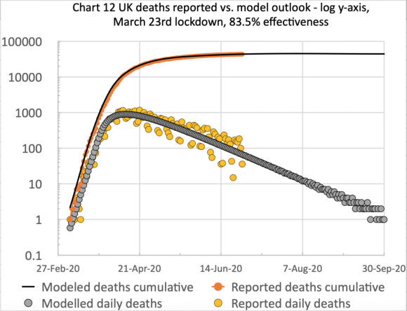
The equivalent forecast from my own model still stands at 44,367 for September 30th, as can be seen from the charts below; but because we are still near the weekend, when the UK reported numbers are always lower, owing to data collection and reporting issues, I shall wait a day or two before updating my model to fit.

But having been watching this carefully for a few weeks, I do think that some unconscious public relaxation of social distancing in the fairer UK weather (in parks, on demonstrations and at beaches, as reported in the press since at least early June) might have something to do with a) case numbers, and b) subsequent numbers of deaths not falling at the expected rate. Here are two of my own charts that illustrate the situation.

In the first chart, we see the reported and modelled deaths to Sunday 28th June; this chart shows clearly that since the end of May, the reported deaths begin to exceed the model prediction, which had been quite accurate (even slightly pessimistic) up to that time.

Model vs. reported deaths, to June 28th 2020
Model vs. reported deaths, linear scale, to June 28th 2020

In the next chart, I show the outlook to September 30th (comparable date to the Worldometers chart above) showing the plateau in deaths at 44,367 (cumulative curve on the log scale). In the daily plots, we can see clearly the significant scatter (largely caused by weekly variations in reporting at weekends) but with the daily deaths forecast to drop to very low numbers by the end of September.

Model vs. reported deaths, cumulative and daily, to Sep 30th 2020
Model vs. reported deaths, log scale, cumulative and daily, to Sep 30th 2020

I will update this forecast in a day or two, once this last weekend’s variations in UK reporting are corrected.


Categories
Box Hill Charity Cycling Leith Hill Prudential RideLondon Strava Surrey Hills

The Surrey Hills in the 2019 Prudential RideLondon 100

This video is about the Surrey Hills part of my Prudential RideLondon 100 in 2019, taking in Leith Hill and Box Hill. It’s a “director’s cut” from my full ride post at https://www.briansutton.uk/?p=1084.

The middle part of the video shows the cycling log-jam on Leith Hill, where we had to stop seven times, losing 10 minutes, on a section of no more than 400 metres, on the less steep, earlier part of the Leith Hill Lane climb.

Someone had fallen off just at the beginning of the steeper part ahead of us. Very frustrating! Apparently he rode off without thanking anyone for the help he was given to get going again.

The Leith Hill ascent is quite narrow, and there are always some cyclists walking on all the steep parts, effectively making it even narrower, which you can see this from the video.

The way to minimise such delays is to get an earlier start time, as advised by my friend Leslie Tennant, who has done the event half a dozen times. That keeps you clear of the slower riders.

But it was a great day overall, with the usual good weather, a big improvement over the previous year’s very wet weather, which I covered in my blog at https://www.briansutton.uk/?p=1108.

Here, then, is my Surrey Hills segment from the 2019 event.

The Prudential Ride London 100 Surrey hills, including Leith Hill and Box Hill

I have added here some screenshots of my Strava analysis for the Leith Hill segment, showing the speed, cadence and heart rate drops during those seven stops.

Time-based Strava analysis chart

First, the plot against time, which shows the speed drops very clearly, annotated as Stops 1 to 7. On the elevation profile, you can see that all of these were on the earlier part of the climb (shaded). The faller must had fallen at the point where the log-jam cleared (when a marshal told me what had happened, as I rode past at that point) at the end of that shaded section.

Important: Note that in this time-based x-axis chart, the time scale has the effect of lengthening (expanding) those parts of the x-axis scale (compared to the distance-based x-axis version later on), where we were ascending, as we took proportionately more time to cover a given distance during the delays (which would have been the case to a lesser extent at normal, slower uphill speeds anyway), and equivalently shortening the descending parts of the hill(s), where we cover more ground in comparatively less time. The shaded section of the chart shows this expansion effect on that (slow) part of the Leith Hill climb (behind the word “Leith”).

Strava analysis showing the 7 stops totalling 10 minutes

We see that the chart runs from about ride time 3:36:40 to 3:46:30, around 10 minutes. On the video I show that the first stop on that section was at time of day 10:47:14, and we got going again fully at 10:57:09, again about 10 minutes from beginning to end.

Distance-based Strava analysis chart

Next, the same Strava analysis, but with the graphs plotted against distance, instead of time.

As the elevation is in metres, the distance-based x-axis presents a more faithful rendition of the inclines – metres of height plotted against against kilometres of distance travelled, in the usual way.

Compared with the time-based chart above, this shows up as steeper ascending parts of all hills in the profile (slow riding), and less steep downsides for the hills (fast riding), which is usual when comparing time vs. distance based Strava ride analysis charts.

You will note that the (lighter) shaded section where the stops occurred is actually very short in the distance based graph (the light vertical line, behind the “i” in the “Leith” annotation) – it looks longer (in the time-based version, as well as apparently less steep as a result) in the darker shaded area of the time-based chart above. In reality, the steepness isn’t significantly different on that section, and it IS short.

Strava analysis showing the 7 stops totalling <400 metres

In this chart, this same section runs from just over 88.6 kms into the ride to just under 89 kms; i.e. between 350 – 400 metres from start to finish, some of which was walking, with a little riding, between periods of standing and waiting.

The little dips in the red heart rate curve at the 7 stops show up a little more clearly* on this chart too.

I eliminated the standing/waiting parts from the video, but you can see that I was moving very slowly even when trying to ride short parts of this section. Average speed on that section was, say, 400m in 10 minutes – 2.4 kms/hour, or 1.5 mph. Even I can ride up that hill a lot faster than that!

*The heart chart dips looks a little like ECG depressed t-waves. I know what those look like – I was diagnosed with depressed t-wave in a BUPA ECG test 50 years ago (for health insurance in my my first private sector job).

Because of that they also stress tested me on a treadmill, and had a problem getting my heart rate up, even raising the front of the treadmill, as well as speeding it up. So they also diagnosed brachycardia (slow heart rate). They found that my ECG returns to a normal pattern on exercise – phew!

Categories
Cycling Mallorca Mallorca Sobremunt

A new look at Sobremunt, the hardest climb in Mallorca

This video is about the Sobremunt climb, especially near the top of the climb which is quite hard to find amongst the various agricultural estates up there – such as the Sobremunt estate itself. I added new music to it, and some more commentary and stills.

Sobremunt, bottom to top, and some exploring

Here is some mapping for the ride:

Here are some views of the profile of the Sobremunt climb, from GCN and Cycle Fiesta:

I have also added the Strava analysis for the climb segment (with the embarrassingly slow time!) from the Ma1041 junction to the top of the Strava segment (not actually the top of the climb, but where I met Niels & Peter (in the video).

And finally, just the route for the climb, some landmarks, and start of the descent:-

The climb from the Ma1041, and the start of the descent past La Posada de Marquès
Categories
Coronavirus Covid-19 Michael Levitt

Coronavirus model tracking, lockdown and lessons

Introduction

This is just a brief update post to confirm that my Coronavirus model is still tracking the daily reported UK data well, and doesn’t currently need any parameter changes.

I go on to highlight some important aspects of emphasis in the Daily Downing St. Update on June 10th, as well as the response to Prof. Neil Ferguson’s comments to the Parliamentary Select Committee for Science and Technology about the impact of an earlier lockdown date, a scenario I have modelled and discussed before.

My model forecast

I show just one chart here that indicates both daily and cumulative figures for UK deaths, thankfully slowing down, and also the model forecast to the medium term, to September 30th, by when the modelled death rate is very low. The outlook in the model is still for 44,400 deaths, although no account is yet taken for reduced intervention effectiveness (from next week) as further, more substantial relaxations are made to the lockdown.

Note that the scatter of the reported daily deaths in the chart below is caused by some delays and resulting catch-up in the reporting, principally (but not only) at weekends. It doesn’t show in the cumulative curve, because the cumulative numbers are so much higher, and these daily variations are small by comparison (apart from when the cumulative numbers are lower, in late February to mid-March).

UK Daily & Cumulative deaths, model vs. Government “all settings” data

It isn’t yet clear whether the imminent lockdown easing (next week) might lead to a sequence of lockdown relaxation, infection rate increase, followed by (some) re-instituted lockdown measures, to be repeated cyclically as described by Neil Ferguson’s team in their 16th March COVID19-NPI-modelling paper, which was so influential on Government at the time (probably known to Government earlier than the paper publication date). If so, then simpler medium to long term forecasting models will have to change, my own included. For now, this is still in line with the Worldometers forecast, pictured here.

Worldometers UK Covid-19 forecast deaths for August 4th 2020

The ONS work

The Office for National Statistics (ONS) have begun to report regularly on deaths where Covid-19 is mentioned on the death certificate, and are also reporting on Excess Deaths, comparing current death rates with the seasonally expected number based on previous years. Both of these measures show larger numbers, as I covered in my June 2nd post, than the Government “all settings” numbers, that include only deaths with a positive Covid-19 test in Hospitals, the Community and Care Homes.

As I also mentioned in that post, no measures are completely without the need for interpretation. For consistency, for the time being, I remain with the Government “all settings” numbers in my model that show a similar rise and fall over the peak of the virus outbreak, but with somewhat lower daily numbers than the other measures, particularly at the peak.

The June 10th Government briefing

This briefing was given by the PM, Boris Johnson, flanked, as he was a week ago, by Sir Patrick Vallance (Chief Scientific Adviser (CSA)) and Prof. Chris Whitty (Chief Medical officer (CMO)), and again, as last week, the scientists offered much more than the politician.

In particular, the question of “regrets” came up from journalist questions, probing what the team might have done differently, in the light of the Prof. Ferguson comment earlier to the Parliamentary Science & Technology Select Committee that lives could have been saved had lockdown been a week earlier (I cover this in a section below).

At first, the shared approach of the CMO and CSA was not only that the scientific approach was always to learn the lessons from such experiences, but also that is was too early to do this, given, as the CMO emphasised very clearly last week, and again this week, that we are in the middle of this crisis, and there is a very long way to go (months, and even more, as he had said last week).

The PM latched onto this, repeating that it was too soon to take the lessons (not something I agree with); and indeed, Prof. Chris Whitty came back and offered that amongst several things he might have done differently, testing was top of the list, and that without it, everyone had been working in the dark.

My opinion is that if there is a long way to go, then we had better apply those lessons that we can learn as we go along, even if, as is probably the case, it is too early to come to conclusions about all aspects. There will no doubt be an inquiry at some point in the future, but that is a long way off, and adjusting our course as we continue to address the pandemic must surely be something we should do.

Parliamentary Science & Technology Select Committee

Earlier that day, on 10th June, Prof. Neil Ferguson of Imperial College had given evidence (or at least a submission) to the Select Committee for Science & Technology, stating that lives could have been saved if lockdown had been a week earlier. He was quoted here as saying “The epidemic was doubling every three to four days before lockdown interventions were introduced. So had we introduced lockdown measures a week earlier, we would have reduced the final death toll by at least a half.

Whilst I think the measures, given what we knew about this virus then, in terms of its transmission and its lethality, were warranted, I’m second guessing at this point, certainly had we introduced them earlier we would have seen many fewer deaths.”

In that respect, therefore, it isn’t merely interesting to look at the lockdown timing issue, but, as a matter of life and death, we should seek to understand how important timing is, as well as the effectiveness of possible interventions.

Surely one of the lessons from the pandemic (if we didn’t know it before) is that for epidemics that have an exponential growth rate (even if only for a while) matters down the track are highly (and non-linearly) dependent on initial conditions and early decisions.

With regard to that specific statement about the timing of the lockdown, I had already modelled the scenario for March 9th lockdown (two weeks earlier than the actual event on the 23rd March) and reported on that in my May 14th and May 25th posts at this blog. The precise quantum of the results is debatable, but, in my opinion, the principle isn’t.

I don’t need to rehearse all of those findings here, but it was clear, even given the limitations of my model (little data, for example, prior to March 9th upon which to calibrate the model, and the questionable % effectiveness of a postulated lockdown at that time, in terms of the public response) that my model forecast was for far fewer cases and deaths – the model said one tenth of those reported (for two weeks earlier lockdown). That is surely too small a fraction, but even part of that saving would be a big difference numerically.

This was also the nature of the findings of an Edinburgh University team, under Prof. Rowland Kao, who worked on the possible numbers for Scotland at that time, as reported by the BBC, which talked of a saving of 80% of the lives lost. Prof Kao had run simulations to see what would have happened to the spread of the virus if Scotland had locked down on 9 March, two weeks earlier.

A report of the June 10th Select Committee discussions mentioned that Prof. Kao supported Prof. Ferguson’s comments (unsurprisingly), finding the Ferguson comments “robust“, given his own team’s experience and work in the area.

Prof Simon Wood, Professor of Statistical Science at the University of Bristol, was reported as saying “I think it is too early to talk about the final death toll, particularly if we include the substantial non-COVID loss of life that has been and will be caused by the effects of lockdown. If the science behind the lockdown is correct, then the epidemic and the counter measures are not over.

Prof. Wood also made some comments relating to some observed pre-lockdown improvements in the death rate (possibly related to voluntary self-isolation which had been advised in some circumstances) which might have reduced the virus growth rate below the pure exponential rate which may have been assumed, and so he felt that “the basis for the ‘at least a half’ figure does not seem robust“.

Prof. James Naismith, Director of the Rosalind Franklin Institute, & Professor of Structural Biology, University of Oxford, was reported as saying “Professor Ferguson has been clear that his analysis is with the benefit of hindsight. His comments are a simple statement of the facts as we now understand them.

The lockdown timing debate

In the June 10th Government briefing, a few hours later, the PM mentioned in passing that Prof. Ferguson was on the SAGE Committee at that time, in early-mid March, as if to imply that this included him in the decision to lockdown later (March 23rd).

But, as I have also reported, in their May 23rd article, the Sunday Times Insight team produced a long investigative piece that indicated that some scientists (from both Imperial College and the London School of Hygiene and Tropical Medicine) had become worried about the lack of action, and proactively produced data and reports (as I mentioned above) that caused the Government to move towards a lockdown approach. The Government refuted this article here.

As we have heard many times, however, advisers advise, and politicians decide; in this case, it would seem that lockdown timing WAS a political decision (taking all aspects into account, including economic impact and the wider health issues) and I don’t have evidence to support Prof. Ferguson being party to the decision, (even if he was party to the advice, which is also dubious, given that his own scientific papers are very clear on the large scale of potential outcomes without NMIs (Non Pharmaceutical Interventions).

His forecasts would very much support a range of early and effective intervention measures to be considered, such as school and university closures, home isolation of cases, household quarantine, large-scale general population social distancing and social distancing of those over 70 years, as compared individually and in different combinations in the paper referenced above.

The forecasts in that paper, however, are regarded by Prof. Michael Levitt as in error (on the pessimistic side), basing forecasts, he says, on a wrong interpretation of the Wuhan data, causing an error by a factor of 10 or more in forecast death rates. Michael says “Thus, the Western World has been encouraged by their lack of responsibility coupled with uncontrolled media and academic errors to commit suicide for an excess burden of death of one month.”

But that Imperial College paper (and others) indicate what was in Neil Ferguson’s mind at that earlier stage. I don’t believe (but don’t know, of course) that his advice would have been to wait until a March 23rd lockdown.

Since SAGE (Scientific Advisory Group for Emergencies) proceedings are not published, it might be a long time before any of this history of the lockdown timing issue becomes clear.

Concluding comment

Now that relaxation of the lockdown is about to be enhanced, I am tracking the reported cases and deaths, and monitoring my Coronavirus model for any impact.

If there were any upwards movement in deaths and case rates, and reversal of any lockdown relaxations were to become necessary, the debate about lockdown timing will, no doubt, revive.

In that case, lessons learned from where we have been in that respect will need to be applied.

Categories
Coronavirus Covid-19 Michael Levitt Reproductive Number Uncategorized

Current Coronavirus model forecast, and next steps

Introduction

This post covers the current status of my UK Coronavirus (SARS-CoV-2) model, stating the June 2nd position, and comparing with an update on June 3rd, reworking my UK SARS-CoV-2 model with 83.5% intervention effectiveness (down from 84%), which reduces the transmission rate to 16.5% of its pre-intervention value (instead of 16%), prior to the 23rd March lockdown.

This may not seem a big change, but as I have said before, small changes early on have quite large effects later. I did this because I see some signs of growth in the reported numbers, over the last few days, which, if it continues, would be a little concerning.

I sensed some urgency in the June 3rd Government update, on the part of the CMO, Chris Whitty (who spoke at much greater length than usual) and the CSA, Sir Patrick Vallance, to highlight the continuing risk, even though the UK Government is seeking to relax some parts of the lockdown.

They also mentioned more than once that the significant “R” reproductive number, although less than 1, was close to 1, and again I thought they were keen to emphasise this. The scientific and medical concern and emphasis was pretty clear.

These changes are in the context of quite a bit of debate around the science between key protagonists, and I begin with the background to the modelling and data analysis approaches.

Curve fitting and forecasting approaches

Curve-fitting approach

I have been doing more homework on Prof. Michael Levitt’s Twitter feed, where he publishes much of his latest work on Coronavirus. There’s a lot to digest (some of which I have already reported, such as his EuroMOMO work) and I see more methodology to explore, and also lots of third party input to the stream, including Twitter posts from Prof. Sir David Spiegelhalter, who also publishes on Medium.

I DO use Twitter, although a lot less nowadays than I used to (8.5k tweets over a few years, but not at such high rate lately); much less is social nowadays, and more is highlighting of my https://www.briansutton.uk/ blog entries.

Core to that work are Michael’s curve fitting methods, in particular regarding the Gompertz cumulative distribution function and the Change Ratio / Sigmoid curve references that Michael describes. Other functions are also available(!), such as The Richard’s function.

This curve-fitting work looks at an entity’s published data regarding cases and deaths (China, the Rest of the World and other individual countries were some important entities that Michael has analysed) and attempts to fit a postulated mathematical function to the data, first to enable a good fit, and then for projections into the future to be made.

This has worked well, most notably in Michael’s work in forecasting, in early February, the situation in China at the end of March. I reported this on March 24th when the remarkable accuracy of that forecast was reported in the press:

The Times coverage on March 24th of Michael Levitt's accurate forecast for China
The Times coverage on March 24th of Michael Levitt’s accurate forecast for China

Forecasting approach

Approaching the problem from a slightly different perspective, my model (based on a model developed by Prof. Alex de Visscher at Concordia University) is a forecasting model, with my own parameters and settings, and UK data, and is currently matching death rate data for the UK, on the basis of Government reported “all settings” deaths.

The model is calibrated to fit known data as closely as possible (using key parameters such as those describing virus transmission rate and incubation period, and then solves the Differential Equations, describing the behaviour of the virus, to arrive at a predictive model for the future. No mathematical equation is assumed for the charts and curve shapes; their behaviour is constructed bottom-up from the known data, postulated parameters, starting conditions and differential equations.

The model solves the differential equations that represent an assumed relationship between “compartments” of people, including, but not necessarily limited to Susceptible (so far unaffected), Infected and Recovered people in the overall population.

I had previously explored such a generic SIR model, (with just three such compartments) using a code based on the Galbraith solution to the relevant Differential Equations. My following post article on the Reproductive number R0 was set in the context of the SIR (Susceptible-Infected-Recovered) model, but my current model is based on Alex’s 7 Compartment model, allowing for graduations of sickness and multiple compartment transition routes (although NOT with reinfection).

SEIR models allow for an Exposed but not Infected phase, and SEIRS models add a loss of immunity to Recovered people, returning them eventually to the Susceptible compartment. There are many such options – I discussed some in one of my first articles on SIR modelling, and then later on in the derivation of the SIR model, mentioning a reference to learn more.

Although, as Michael has said, the slowing of growth of SARS-CoV-2 might be because it finds it hard to locate further victims, I should have thought that this was already described in the Differential Equations for SIR related models, and that the compartment links in the model (should) take into account the effect of, for example, social distancing (via the effectiveness % parameter in my model). I will look at this further.

The June 2nd UK reported and modelled data

Here are my model output charts exactly up to, June 2nd, as of the UK Government briefing that day, and they show (apart from the last few days over the weekend) a very close fit to reported death data**. The charts are presented as a sequence of slides:

These charts all represent the same UK deaths data, but presented in slightly different ways – linear and log y-axes; cumulative and daily numbers; and to date, as well as the long term outlook. The current long term outlook of 42,550 deaths in the UK is within error limits of the the Worldometers linked forecast of 44,389, presented at https://covid19.healthdata.org/united-kingdom, but is not modelled on it.

**I suspected that my 84% effectiveness of intervention would need to be reduced a few points (c. 83.5%) to reflect a little uptick in the UK reported numbers in these charts, but I waited until midweek, to let the weekend under-reporting work through. See the update below**.

I will also be interested to see if that slight uptick we are seeing on the death rate in the linear axis charts is a consequence of an earlier increase in cases. I don’t think it will be because of the very recent and partial lockdown relaxations, as the incubation period of the SARS-CoV-2 virus means that we would not see the effects in the deaths number for a couple of weeks at the earliest.

I suppose, anecdotally, we may feel that UK public response to lockdown might itself have relaxed a little over the last two or three weeks, and might well have had an effect.

The periodic scatter of the reported daily death numbers around the model numbers is because of the reguar weekend drop in numbers. Reporting is always delayed over weekends, with the ground caught up over the Monday and Tuesday, typically – just as for 1st and 2nd June here.

A few numbers are often reported for previous days at other times too, when the data wasn’t available at the time, and so the specific daily totals are typically not precisely and only deaths on that particular day.

The cumulative charts tend to mask these daily variations as the cumulative numbers dominate small daily differences. This applies to the following updated charts too.

**June 3rd update for 83.5% intervention effectiveness

I have reworked the model for 83.5% intervention effectiveness, which reduces the transmission rate to 16.5% of its starting value, prior to 23rd March lockdown. Here is the equivalent slide set, as of 3rd June, one day later, and included in this post to make comparisons easier:

These charts reflect the June 3rd reported deaths at 39,728 and daily deaths on 3rd June of 359. The model long-term prediction is 44,397 deaths in this scenario, almost exactly the Worldometer forecast illustrated above.

We also see the June 3rd reported and modelled cumulative numbers matching, but we will have to watch the growth rate.

Concluding remarks

I’m not as concerned to model cases data as accurately, because the reported numbers are somewhat uncertain, collected as they are in different ways by four Home Countries, and by many different regions and entities in the UK, with somewhat different definitions.

My next steps, as I said, are to look at the Sigmoid and data fitting charts Michael uses, and compare the same method to my model generated charts.

*NB The UK Office for National Statistics (ONS) has been working on the Excess Deaths measure, amongst other data, including deaths where Covid-19 is mentioned on the death certificate, not requiring a positive Covid-19 test as the Government numbers do.

As of 2nd June, the Government announced 39369 deaths in its standard “all settings” – Hospitals, Community AND Care homes (with a Covid-19 test diagnosis) but the ONS are mentioning 62,000 Excess Deaths today. A little while ago, on the 19th May, the ONS figure was 55,000 Excess Deaths, compared with 35,341 for the “all settings” UK Government number. I reported that in my blog post https://www.briansutton.uk/?p=2302 in my EuroMOMO data analysis post.

But none of the ways of counting deaths is without its issues. As the King’s Fund says on their website, “In addition to its direct impact on overall mortality, there are concerns that the Covid-19 pandemic may have had other adverse consequences, causing an increase in deaths from other serious conditions such as heart disease and cancer.

“This is because the number of excess deaths when compared with previous years is greater than the number of deaths attributed to Covid-19. The concerns stem, in part, from the fall in numbers of people seeking health care from GPs, accident and emergency and other health care services for other conditions.

“Some of the unexplained excess could also reflect under-recording of Covid-19 in official statistics, for example, if doctors record other causes of death such as major chronic diseases, and not Covid-19. The full impact on overall and excess mortality of Covid-19 deaths, and the wider impact of the pandemic on deaths from other conditions, will only become clearer when a longer time series of data is available.”