Categories
Coronavirus Covid-19 Michael Levitt

Mechanistic and curve-fitting UK modelling comparison

Introduction

In my most recent post, I summarised the various methods of Coronavirus modelling, ranging from phenomenological “curve-fitting” and statistical methods, to the SIR-type models which are developed from differential equations representing postulated incubation, infectivity, transmissibility, duration and immunity characteristics of the SARS-Cov-2 virus pandemic.

The phenomenological methods don’t delve into those postulated causations and transitions of people between Susceptible, Infected, Recovered and any other “compartments” of people for which a mechanistic model simulates the mechanisms of transfers (hence “mechanistic”).

Types of mechanistic SIR models

Some SIR-type mechanistic models can include temporary immunity (or no immunity) (SIRS) models, where the recovered person may return to the susceptible compartment after a period (or no period) of immunity.

SEIRS models allow for an Exposed compartment, for people who have been exposed to the virus, but whose infection is latent for a period, and so who are not infective yet. I discussed some options in my late March post on modelling work reported by the BBC.

My model, based on Alex de Visscher’s code, with my adaptations for the UK, has seven compartments – Uninfected, Infected, Sick, Seriously Sick, Better, Recovered and Deceased. There are many variations on this kind of model, which is described in my April 14th post on modelling progress.

Phenomenological curve-fitting

I have been focusing, in my review of modelling methods, on Prof. Michael Levitt’s curve-fitting approach, which seems to be a well-known example of such modelling, as reported in his recent paper. His small team have documented Covid-19 case and death statistics from many countries worldwide, and use a similar curve-fitting approach to fit current data, and then to forecast how the epidemics might progress, in all of those countries.

Because of the scale of such work, a time-efficient predictive curve-fitting algorithm is attractive, and they have found that a Gompertz function, with appropriately set parameters (three of them) can not only fit the published data in many cases, but also, via a mathematically derived display method for the curves, postulate a straight line predictor (on such “log” charts), facilitating rapid and accurate fitting and forecasting.

Such an approach makes no attempt to explain the way the virus works (not many models do) or to calibrate the rates of transition between the various compartments, which is attempted by the SIR-type models (although requiring tuning of the differential equation parameters for infection rates etc).

In response to the forecasts from these models, then, we see many questions being asked about why the infection rates, death rates and other measured statistics are as they are, differing quite widely from country to country.

There is so much unknown about how SARS-Cov-2 infects humans, and how Covid-19 infections progress; such data models inform the debate, and in calibrating the trajectory of the epidemic data, contribute to planning and policy as part of a family of forecasts.

The problem with data

I am going to make no attempt in this paper, or in my work generally, to model more widely than the UK.

What I have learned from my work so far, in the UK, is that published numbers for cases (particularly) and even, to some extent, for deaths can be unreliable (at worst), untimely and incomplete (often) and are also adjusted historically from time to time as duplication, omission and errors have come to light.

Every week, in the UK, there is a drop in numbers at weekends, recovered by increases in reported numbers on weekdays to catch up. In the UK, the four home countries (and even regions within them) collate and report data in different ways; as recently as July 17th, the Northern Ireland government have said that the won’t be reporting numbers at weekends.

Across the world, I would say it is impossible to compare statistics on a like-for-like basis with any confidence, especially given the differing cultural, demographic and geographical aspects; government policies, health service capabilities and capacities; and other characteristics across countries.

The extent of the (un)reliability in the reported numbers across nations worldwide (just like the variations in the four home UK countries, and in the regions), means that trying to forecast at a high level for all countries is very difficult. We also read of significant variations in the 50 states of the USA in such matters.

Hence my reluctance to be drawn into anything wider than monitoring and trying to predict UK numbers.

Curve fitting my UK model forecast

I thought it would be useful, at least for my understanding, to apply a phenomenological curve fitting approach to some of the UK reported data, and also to my SIR-style model forecast, based on that data.

I find the UK case numbers VERY inadequate for that purpose. There is a fair expectation that we are only seeing a minority fraction (as low as 8% in the early stages, in Italy for example) of the actual infections (cases) in the UK (and elsewhere).

The very definition of what comprises a case is somewhat variable; in the UK we talk about confirmed cases (by test), but the vast majority of people are never tested (owing to a lack of symptoms, and/or not being in hospital) although millions (9 million to date in the UK) of tests have either been done or requested (but not necessarily returned in all cases).

Reported numbers of tests might involve duplication since some people are (rightly) tested multiple times to monitor their condition. It must be almost impossible to make such interpretations consistently across large numbers of countries.

Even the officially reported UK deaths data is undeniably incomplete, since the “all settings” figures the UK Government reports (and at the outset even this had only been hospital deaths, with care homes added (and then retrospectively edited in later on) are not the “excess” deaths that the UK Office for National Statistics (ONS) also track, and that many commentators follow. For consistency I have continued to use the Government reported numbers, their having been updated historically on the same basis.

Rather than using case numbers, then, I will simply make the curve-fitting vs. mechanistic modelling comparison on both the UK reported deaths and the forecasted deaths in my model, which has tracked the reporting fairly well, with some recent adjustments (made necessary by the process of gradual and partial lockdown relaxation during June, I believe).

I had reduced the lockdown intervention effectiveness in my model by 0.5% at the end of June from 83.5% to 83%, because during the relaxations (both informal and formal) since the end of May, my modelled deaths had begun to lag the reported deaths during the month of June.

This isn’t surprising, and is an indicator to me, at least, that lockdown relaxation has somewhat reduced the rate of decline in cases, and subsequently deaths, in the UK.

My current forecast data

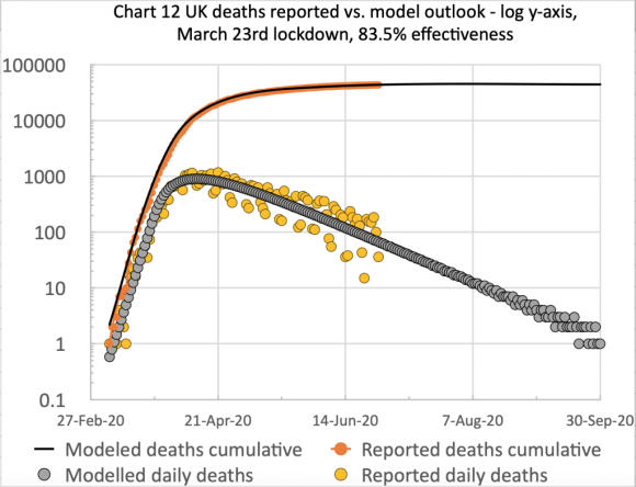
Firstly, I present my usual two charts summarising my model’s fit to reported UK data up to and including 16th July.

On the left we see the the typical form of the S-curve that epidemic cumulative data takes, and on the right, the scatter (the orange dots) in the reported daily data, mainly owing to regular incompleteness in weekend reporting, recovered during the following week, every week. I emphasise that the blue and grey curves are my model forecast, with appropriate parameters set for its differential equations (e.g. the 83% intervention effectiveness starting on March 23rd), and are not best fit analytical curves retro-applied to the data.

Next see my model forecast, further out to September 30th, by when forecast daily deaths have dropped to less than one per day, which I will also use to compare with the curve fitting approach. The cumulative deaths plateau, long term, is for 46,421 deaths in this forecast.

UK deaths, reported vs. model, 83%, cumulative and daily, to 30th September

The curve-fitting Gompertz function

I have simplified the calculation of the Gompertz function, since I merely want to illustrate its relationship to my UK forecast – not to use it in anger as my main process, or to develop multiple variations for different countries. Firstly my own basic charts of reported and modelled deaths.

On the left we see the reported data, with the weekly variations I mentioned before (hence the 7-day average to make the trend clearer) and on the right, the modelled version, showing how close the fit is, up to 16th July.

On any given day, the 7-day average lags the barchart numbers when the numbers are growing, and exceeds the numbers when they are declining, as it is taking 7 numbers prior to and up to the reporting day, and averaging them. You can see this more clearly on the right for the smoother modelled numbers (where the averaging isn’t really necessary, of course).

It’s also worth mentioning that the Gompertz function fitting allows its analytical statistical function curve to fit the observed varying growth rate of this SARS-Cov-2 pandemic, with its asymmetry of a slower decline than the steeper ramp-up (sub-exponential though it is) as seen in the charts above.

I now add, to the reported data chart, a graphical version including a derivation of the Gompertz function (the green line) for which I show its straight line trend (the red line). The jagged appearance of the green Gompertz curve on the right is caused by the weekend variation in the reported data, mentioned before.

Those working in the field would use smoothed reported data to reduce this unnecessary clutter, but this adds a layer of complexity to the process, requiring its own justifications, whose detail (and different smoothing options) are out of proportion with this summary.

But for my model forecast, we will see a smoother rendition of the data going into this process. See Michael Levitt’s paper for a discussion of the smoothing options his team uses for data from the many countries the scope of his work includes.

Of course, there are no reported numbers beyond today’s date (16th July) so my next charts, again with the Gompertz equation lines added (in green), compare the fit of the Gompertz version of my model forecast up to July 16th (on the right) with the reported data version (on the left) from above – part of the comparison purpose of this exercise.

The next charts, with the Gompertz equation lines added (in green), compare the fit of my model forecast only (i.e. not the reported data) up to July 16th on the left, with the forecast out to September 30th on the right.

What is notable about the charts is the nearly straight line appearance of the Gompertz version of the data. The wiggles approaching late September on the right are caused by some gaps in the data, as some of the predicted model numbers for daily deaths are zero at that point; the ratios (c(t)/c(t-1)) and logarithmic calculation Ln(c(t)/c(t-1)) have some necessary gaps on some days (division by 0, and ln(0) being undefined).

Discussion

The Gompertz method potentially allows a straight line extrapolation of the reported data in this form, instead of developing SIR-style non-linear differential equations for every country. This means much less scientific and computer time to develop and process, so that Michael Levitt’s team can process many country datasets quickly, via the Gompertz functional representation of reported data, to create the required forecasts.

As stated before, this method doesn’t address the underlying mechanisms of the spread of the epidemic, but policy makers might sometimes simply need the “what” of the outlook, and not the “how” and “why”. The assessment of the infectivity and other disease characteristics, and the related estimation of their representation by coefficients in the differential equations for mechanistic models, might not be reliably and quickly done for this novel virus in so many different countries.

When policy makers need to know the potential impact of their interventions and actions, then mechanistic models can and do help with those dependencies, under appropriate assumptions.

As mentioned in my recent post on modelling methods, such mechanistic models might use mobility and demographic data to predict contact rates, and will, at some level of detail, model interventions such as social distancing, hygiene improvements and the use of masks, as well as self-isolation (or quarantine) for suspected cases, and for people in high risk groups (called shielding in the UK) such as the elderly or those with underlying health conditions.

Michael Levitt’s (and other) phenomenological methods don’t do this, since they are fitting chosen analytical functions to the (cleaned and smoothed) cases or deaths data, looking for patterns in the “output” data for the epidemic in a country, rather than for the causations for, and implications of the “input” data.

In Michael’s case, an important variable that is used is the ratio of successive days’ cases data, which means that the impact of national idiosyncrasies in data collection are minimised, since the same method is in use on successive days for the given country.

In reality, the parameters that define the shape (growth rate, inflection point and decline rate) of the specific Gompertz function used would also have to be estimated or calculated, with some advance idea of the plateau figure (what is called the “carrying capacity” of the related Generalised Logistics Functions (GLFs) of which the Gompertz functions comprise a subset).

I have taken some liberties here with the process, since my aim was simply to illustrate the technique using a forecast I already have.

Closing remarks

I have some corrective and clarification work to do on this methodology, but my intention has merely been to compare and contrast two methods of producing Covid-19 forecasts – phenomenological curve-fitting vs. SIR modelling.

These is much that the professionals in this field have yet to do. Many countries are struggling to move from blanket lockdown, through to a more targeted approach, using modelling to calibrate the changing effect of the various sub-measures in the lockdown package. I covered some of those differential effects of intervention options in my post on June 28th, including the consideration of any resulting “herd immunity” as a future impact of the relative efficacy of current intervention methods.

From a planning and policy perspective, Governments have to consider the collateral health impact of such interventions, which is why the excess deaths outlook is important, taking into account the indirect effect of both Covid-19 infections, and also the cumulative health impacts of the methods (such as quarantining and social distancing) used to contain the virus.

One of these negative impacts is on the take-up of diagnosis and treatment of other serious conditions which might well cause many further excess deaths next year, to which I referred in my modelling update post of July 6th, referencing a report by Health Data Research UK, quoting Data-Can.org.uk about the resulting cancer care issues in the UK.

Politicians also have to cope with the economic impact, which also feeds back into the nation’s health.

Hence the narrow numbers modelling I have been doing is only a partial perspective on a very much bigger set of problems.

Categories
Coronavirus Covid-19 Herd Immunity Imperial College Reproductive Number

Some thoughts on the current UK Coronavirus position

Introduction

A couple of interesting articles on the Coronavirus pandemic came to my attention this week; a recent one in National Geographic on June 26th, highlighting a startling comparison, between the USA’s cases history, and recent spike in case numbers, with the equivalent European data, referring to an older National Geographic article, from March, by Cathleen O’Grady, referencing a specific chart based on work from the Imperial College Covid-19 Response team.

I noticed, and was interested in that reference following a recent interaction I had with that team, regarding their influential March 16th paper. It prompted more thought about “herd immunity” from Covid-19 in the UK.

Meanwhile, my own forecasting model is still tracking published data quite well, although over the last couple of weeks I think the published rate of deaths is slightly above other forecasts as well as my own.

The USA

The recent National Geographic article from June 26th, by Nsikan Akpan, is a review of the current situation in the USA with regard to the recent increased number of new confirmed Coronavirus cases. A remarkable chart at the start of that article immediately took my attention:

7 day average cases from the US Census Bureau chart, NY Times / National Geographic

The thrust of the article concerned recommendations on public attitudes, activities and behaviour in order to reduce the transmission of the virus. Even cases per 100,000 people, the case rate, is worse and growing in the USA.

7 day average cases per 100,000 people from the US Census Bureau chart, NY Times / National Geographic

A link between this dire situation and my discussion below about herd immunity is provided by a reported statement in The Times by Dr Anthony Fauci, Director of the National Institute of Allergy and Infectious Diseases, and one of the lead members of the Trump Administration’s White House Coronavirus Task Force, addressing the Covid-19 pandemic in the United States.

Reported Dr Fauci quotation by the Times newspaper 30th June 2020

If the take-up of the vaccine were 70%, and it were 70% effective, this would result in roughly 50% herd immunity (0.7 x 0.7 = 0.49).

If the innate characteristics of the the SARS-CoV-2 virus don’t change (with regard to infectivity and duration), and there is no other human-to-human infection resistance to the infection not yet understood that might limit its transmission (there has been some debate about this latter point, but this blog author is not a virologist) then 50% is unlikely to be a sufficient level of population immunity.

My remarks later about the relative safety of vaccination (eg MMR) compared with the relevant diseases themselves (Rubella, Mumps and Measles in that case) might not be supported by the anti-Vaxxers in the US (one of whose leading lights is the disgraced British doctor, Andrew Wakefield).

This is just one more complication the USA will have in dealing with the Coronavirus crisis. It is one, at least, that in the UK we won’t face to anything like the same degree when the time comes.

The UK, and implications of the Imperial College modelling

That article is an interesting read, but my point here isn’t really about the USA (worrying though that is), but about a reference the article makes to some work in the UK, at Imperial College, regarding the effectiveness of various interventions that have been or might be made, in different combinations, work reported in the National Geographic back on March 20th, a pivotal time in the UK’s battle against the virus, and in the UK’s decision making process.

This chart reminded me of some queries I had made about the much-referenced paper by Neil Ferguson and his team at Imperial College, published on March 16th, that seemed (with others, such as the London School of Hygiene and Infectious Diseases) to have persuaded the UK Government towards a new approach in dealing with the pandemic, in mid to late March.

Possible intervention strategies in the fight against Coronavirus

The thrust of this National Geographic article, by Cathleen O’Grady, was that we will need “herd immunity” at some stage, even if the Imperial College paper of March 16th (and other SAGE Committee advice, including from the Scientific Pandemic Influenza Group on Modelling (SPI-M)) had persuaded the Government to enforce several social distancing measures, and by March 23rd, a combination of measures known as UK “lockdown”, apparently abandoning the herd immunity approach.

The UK Government said that herd immunity had never been a strategy, even though it had been mentioned several times, in the Government daily public/press briefings, by Sir Patrick Vallance (UK Chief Scientific Adviser (CSA)) and Prof Chris Whitty (UK Chief Medical Officer (CMO)), the co-chairs of SAGE.

The particular part of the 16th March Imperial College paper I had queried with them a couple of weeks ago was this table, usefully colour coded (by them) to allow the relative effectiveness of the potential intervention measures in different combinations to be assessed visually.


PC=school and university closure, CI=home isolation of cases, HQ=household quarantine, SD=large-scale general population social distancing, SDOL70=social distancing of those over 70 years for 4 months (a month more than other interventions)

Why was it, I wondered, that in this chart (on the very last page of the paper, and referenced within it) the effectiveness of the three measures “CI_HQ_SD” in combination (home isolation of cases, household quarantine & large-scale general population social distancing) taken together (orange and yellow colour coding), was LESS than the effectiveness of either CI_HQ or CI_SD taken as a pair of interventions (mainly yellow and green colour coding)?

The explanation for this was along the following lines.

It’s a dynamical phenomenon. Remember mitigation is a set of temporary measures. The best you can do, if measures are temporary, is go from the “final size” of the unmitigated epidemic to a size which just gives herd immunity.

If interventions are “too” effective during the mitigation period (like CI_HQ_SD), they reduce transmission to the extent that herd immunity isn’t reached when they are lifted, leading to a substantial second wave. Put another way, there is an optimal effectiveness of mitigation interventions which is <100%.

That is CI_HQ_SDOL70 for the range of mitigation measures looked at in the report (mainly a green shaded column in the table above).

While, for suppression, one wants the most effective set of interventions possible.

All of this is predicated on people gaining immunity, of course. If immunity isn’t relatively long-lived (>1 year), mitigation becomes an (even) worse policy option.

Herd Immunity

The impact of very effective lockdown on immunity in subsequent phases of lockdown relaxation was something I hadn’t included in my own (single phase) modelling. My model can only (at the moment) deal with one lockdown event, with a single-figure, averaged intervention effectiveness percentage starting at that point. Prior data is used to fit the model. It has served well so far, until the point (we have now reached) at which lockdown relaxations need to be modelled.

But in my outlook, potentially, to modelling lockdown relaxation, and the potential for a second (or multiple) wave(s), I had still been thinking only of higher % intervention effectiveness being better, without taking into account that negative feedback to the herd immunity characteristic, in any subsequent more relaxed phase, other than through the effect of the changing comparative compartment sizes in the SIR-style model differential equations.

I covered the 3-compartment SIR model in my blog post on April 8th, which links to my more technical derivation here, and more complex models (such as the Alex de Visscher 7-compartment model I use in modified form, and that I described on April 14th) that are based on this mathematical model methodology.

In that respect, the ability for the epidemic to reproduce, at a given time “t” depends on the relative sizes of the infected (I) vs. the susceptible (S, uninfected) compartments. If the R (recovered) compartment members don’t return to the S compartment (which would require a SIRS model, reflecting waning immunity, and transitions from R back to the S compartment) then the ability of the virus to find new victims is reducing as more people are infected. I discussed some of these variations in my post here on March 31st.

My method might have been to reduce the % intervention effectiveness from time to time (reflecting the partial relaxation of some lockdown measures, as Governments are now doing) and reimpose it to a higher % effectiveness if and when the Rt (the calculated R value at some time t into the epidemic) began to get out of control. For example, I might relax lockdown effectiveness from 90% to 70% when Rt reached Rt<0.7, and increase again to 90% when Rt reached Rt>1.2.

This was partly owing to the way the model is structured, and partly to the lack of disaggregated data I would have available to me for populating anything more sophisticated. Even then, the mathematics (differential equations) of  the cyclical modelling was going to be a challenge.

In the Imperial College paper, which does model the potential for cyclical peaks (see below), the “trigger” that is used to switch on and off the various intervention measures doesn’t relate to Rt, but to the required ICU bed occupancy. As discussed above, the intervention effectiveness measures are a much more finely drawn range of options, with their overall effectiveness differing both individually and in different combinations. This is illustrated in the paper (a slide presented in the April 17th Cambridge Conversation I reported in my blog article on Model Refinement on April 22nd):

What is being said here is that if we assume a temporary intervention, to be followed by a relaxation in (some of) the measures, the state in which the population is left with regard to immunity at the point of change is an important by-product to be taken into account in selecting the (combination of) the measures taken, meaning that the optimal intervention for the medium/long term future isn’t necessarily the highest % effectiveness measure or combined set of measures today.

The phrase “herd immunity” has been an ugly one, and the public and press winced somewhat (as I did) when it was first used by Sir Patrick Vallance; but it is the standard term for what is often the objective in population infection situations, and the National Geographic articles are a useful reminder of that, to me at least.

The arithmetic of herd immunity, the R number and the doubling period

I covered the relevance and derivation of the R0 reproduction number in my post on SIR (Susceptible-Infected-Recovered) models on April 8th.

In the National Geographic paper by Cathleen O’Grady, a useful rule of thumb was implied, regarding the relationship between the herd immunity percentage required to control the growth of the epidemic, and the much-quoted R0 reproduction number, interpreted sometimes as the number of people (in the susceptible population) one infected person infects on average at a given phase of the epidemic. When Rt reaches one or less, at a given time t into the epidemic, so that one person is infecting one or fewer people, on average, the epidemic is regarded as having stalled and to be under control.

Herd immunity and R0

One example given was measles, which was stated to have a possible starting R0 value of 18, in which case almost everyone in the population needs to act as a buffer between an infected person and a new potential host. Thus, if the starting R0 number is to be reduced from 18 to Rt<=1, measles needs A VERY high rate of herd immunity – around 17/18ths, or ~95%, of people needing to be immune (non-susceptible). For measles, this is usually achieved by vaccine, not by dynamic disease growth. (Dr Fauci had mentioned over 95% success rate in the US previously for measles in the reported quotation above).

Similarly, if Covid-19, as seems to be the case, has a lower starting infection rate (R0 number) than measles, nearer to between 2 and 3 (2.5, say (although this is probably less than it was in the UK during March; 3-4 might be nearer, given the epidemic case doubling times we were seeing at the beginning*), then the National Geographic article says that herd immunity should be achieved when around 60 percent of the population becomes immune to Covid-19. The required herd immunity H% is given by H% = (1 – (1/2.5))*100% ~= 60%.

Whatever the real Covid-19 innate infectivity, or reproduction number R0 (but assuming R0>1 so that we are in an epidemic situation), the required herd immunity H% is given by:

H%=(1-(1/R0))*100%  (1)

(*I had noted that 80% was referenced by Prof. Chris Whitty (CMO) as loose talk, in an early UK daily briefing, when herd immunity was first mentioned, going on to mention 60% as more reasonable (my words). 80% herd immunity would correspond to R0=5 in the formula above.)

R0 and the Doubling time

As a reminder, I covered the topic of the cases doubling time TD here; and showed how it is related to R0 by the formula;

R0=d(loge2)/T (2)

where d is the disease duration in days.

Thus, as I said in that paper, for a doubling period TD of 3 days, say, and a disease duration d of 2 weeks, we would have R0=14×0.7/3=3.266.

If the doubling period were 4 days, then we would have R0=14×0.7/4=2.45.

As late as April 2nd, Matt Hancock (UK secretary of State for Health) was saying that the doubling period was between 3 and 4 days (although either 3 or 4 days each leads to quite different outcomes in an exponential growth situation) as I reported in my article on 3rd April. The Johns Hopkins comparative charts around that time were showing the UK doubling period for cases as a little under 3 days (see my March 24th article on this topic, where the following chart is shown.)

In my blog post of 31st March, I reported a BBC article on the epidemic, where the doubling period for cases was shown as 3 days, but for deaths it was between 2 and 3 days ) (a Johns Hopkins University chart).

Doubling time and Herd Immunity

Doubling time, TD(t) and the reproduction number, Rt can be measured at any time t during the epidemic, and their measured values will depend on any interventions in place at the time, including various versions of social distancing. Once any social distancing reduces or stops, then these measured values are likely to change – TD downwards and Rt upwards – as the virus finds it relatively easier to find victims.

Assuming no pharmacological interventions (e.g. vaccination) at such time t, the growth of the epidemic at that point will depend on its underlying R0 and duration d (innate characteristics of the virus, if it hasn’t mutated**) and the prevailing immunity in the population – herd immunity. 

(**Mutation of the virus would be a concern. See this recent paper (not peer reviewed)

The doubling period TD(t) might, therefore, have become higher after a phase of interventions, and correspondingly Rt < R0, leading to some lockdown relaxation; but with any such interventions reduced or removed, the subsequent disease growth rate will depend on the interactions between the disease’s innate infectivity, its duration in any infected person, and how many uninfected people it can find – i.e. those without the herd immunity at that time.

These factors will determine the doubling time as this next phase develops, and bearing these dynamics in mind, it is interesting to see how all three of these factors – TD(t), Rt and H(t) – might be related (remembering the time dependence – we might be at time t, and not necessarily at the outset of the epidemic, time zero).

Eliminating R from the two equations (1) and (2) above, we can find: 

H=1-TD/d(loge2) (3)

So for doubling period TD=3 days, and disease duration d=14 days, H=0.7; i.e. the required herd immunity H% is 70% for control of the epidemic. (In this case, incidentally, remember from equation (2) that R0=14×0.7/3=3.266.)

(Presumably this might be why Dr Fauci would settle for a 70-75% effective vaccine (the H% number), but that would assume 100% take-up, or, if less than 100%, additional immunity acquired by people who have recovered from the infection. But that acquired immunity, if it exists (I’m guessing it probably would) is of unknown duration. So many unknowns!)

For this example with 14 day infection period d, and exploring the reverse implications by requiring Rt to tend to 1 (so postulating in this way (somewhat mathematically pathologically) that the epidemic has stalled at time t) and expressing equation (2) as:

TD (t)= d(loge2)/Rt (4)

then we see that TD(t)= 14*loge(2) ~= 10 days, at this time t, for Rt~=1.

Thus a sufficiently long doubling period, with the necessary minimum doubling period depending on the disease duration d (14 days in this case), will be equivalent to the Rt value being low enough for the growth of the epidemic to be controlled – i.e. Rt <=1 – so that one person infects one or less people on average.

Confirming this, equation (3) tells us, for the parameters in this (somewhat mathematically pathological) example, that with TD(t)=10 and d=14,

H(t) = 1 – (10/14*loge(2)) ~= 1-1 ~= 0, at this time t.

In this situation, the herd immunity H(t) (at this time t) required is notionally zero, as we are not in epidemic conditions (Rt~=1). This is not to say that the epidemic cannot restart – it simply means that if these conditions are maintained, with Rt reducing to 1, and the doubling period being correspondingly long enough, possibly achieved through social distancing (temporarily), across whole or part of the population (which might be hard to sustain) then we are controlling the epidemic.

It is when the interventions are reduced, or removed altogether that the sufficiency of % herd immunity in the population will be tested, as we saw from the Imperial College answer to my question earlier. As they say in their paper:

Once interventions are relaxed (in the example in Figure 3, from September onwards), infections begin to rise, resulting in a predicted peak epidemic later in the year. The more successful a strategy is at temporary suppression, the larger the later epidemic is predicted to be in the absence of vaccination, due to lesser build-up of herd immunity.

Herd immunity summary

Usually herd immunity is achieved through vaccination (eg the MMR vaccination for Rubella, Mumps and Measles). It involves less risk than the symptoms and possible side-effects of the disease itself (for some diseases at least, if not for chicken-pox, for which I can recall parents hosting chick-pox parties to get it over and done with!)

The issue, of course, with Covid-19, is that no-one knows yet if such a vaccine can be developed, if it would be safe for humans, if it would work at scale, for how long it might confer immunity, and what the take-up would be.

Until a vaccine is developed, and until the duration of any CoVid-19 immunity (of recovered patients) is known, this route remains unavailable.

Hence, as the National Geographic article says, there is continued focus on social distancing, as an effective part of even a somewhat relaxed lockdown, to control transmission of the virus.

Is there an uptick in the UK?

All of the above context serves as a (lengthy) introduction to why I am monitoring the published figures at the moment, as the UK has been (informally as well as formally) relaxing some aspects of it lockdown, imposed on March 23rd, but with gradual changes since about the end of May, both in the public’s response and in some of the Government interventions.

My own forecasting model (based on the Alex de Visscher MatLab code, and my variations, implemented in the free Octave version of the MatLab code-base) is still tracking published data quite well, although over the last couple of weeks I think the published rate of deaths is slightly above other forecasts, as well as my own.

Worldometers forecast

The Worldometers forecast is showing higher forecast deaths in the UK than when I reported before – 47924 now vs. 43,962 when I last posted on this topic on June 11th:

Worldometers UK deaths forecast based on Current projection scenario by Oct 1, 2020
My forecasts

The equivalent forecast from my own model still stands at 44,367 for September 30th, as can be seen from the charts below; but because we are still near the weekend, when the UK reported numbers are always lower, owing to data collection and reporting issues, I shall wait a day or two before updating my model to fit.

But having been watching this carefully for a few weeks, I do think that some unconscious public relaxation of social distancing in the fairer UK weather (in parks, on demonstrations and at beaches, as reported in the press since at least early June) might have something to do with a) case numbers, and b) subsequent numbers of deaths not falling at the expected rate. Here are two of my own charts that illustrate the situation.

In the first chart, we see the reported and modelled deaths to Sunday 28th June; this chart shows clearly that since the end of May, the reported deaths begin to exceed the model prediction, which had been quite accurate (even slightly pessimistic) up to that time.

Model vs. reported deaths, to June 28th 2020
Model vs. reported deaths, linear scale, to June 28th 2020

In the next chart, I show the outlook to September 30th (comparable date to the Worldometers chart above) showing the plateau in deaths at 44,367 (cumulative curve on the log scale). In the daily plots, we can see clearly the significant scatter (largely caused by weekly variations in reporting at weekends) but with the daily deaths forecast to drop to very low numbers by the end of September.

Model vs. reported deaths, cumulative and daily, to Sep 30th 2020
Model vs. reported deaths, log scale, cumulative and daily, to Sep 30th 2020

I will update this forecast in a day or two, once this last weekend’s variations in UK reporting are corrected.